Parallel Poker
Parallel Poker is an app that improves your poker playing by analysing your decisions and comparing them against all the other possible alternatives on the same hand. It does this with Poker Solver technology and represents a new approach to Poker apps.
I gave some advice on web design and branding in February, to help them appeal to their customers and present their product in a light that emphasised its appeal.
As part of this I also offered improvements to the creative copy.
Background


When reviewing the website I felt that there was a huge potential for the copy to do more, so I sat down and thought about how to push it further
Creative copy
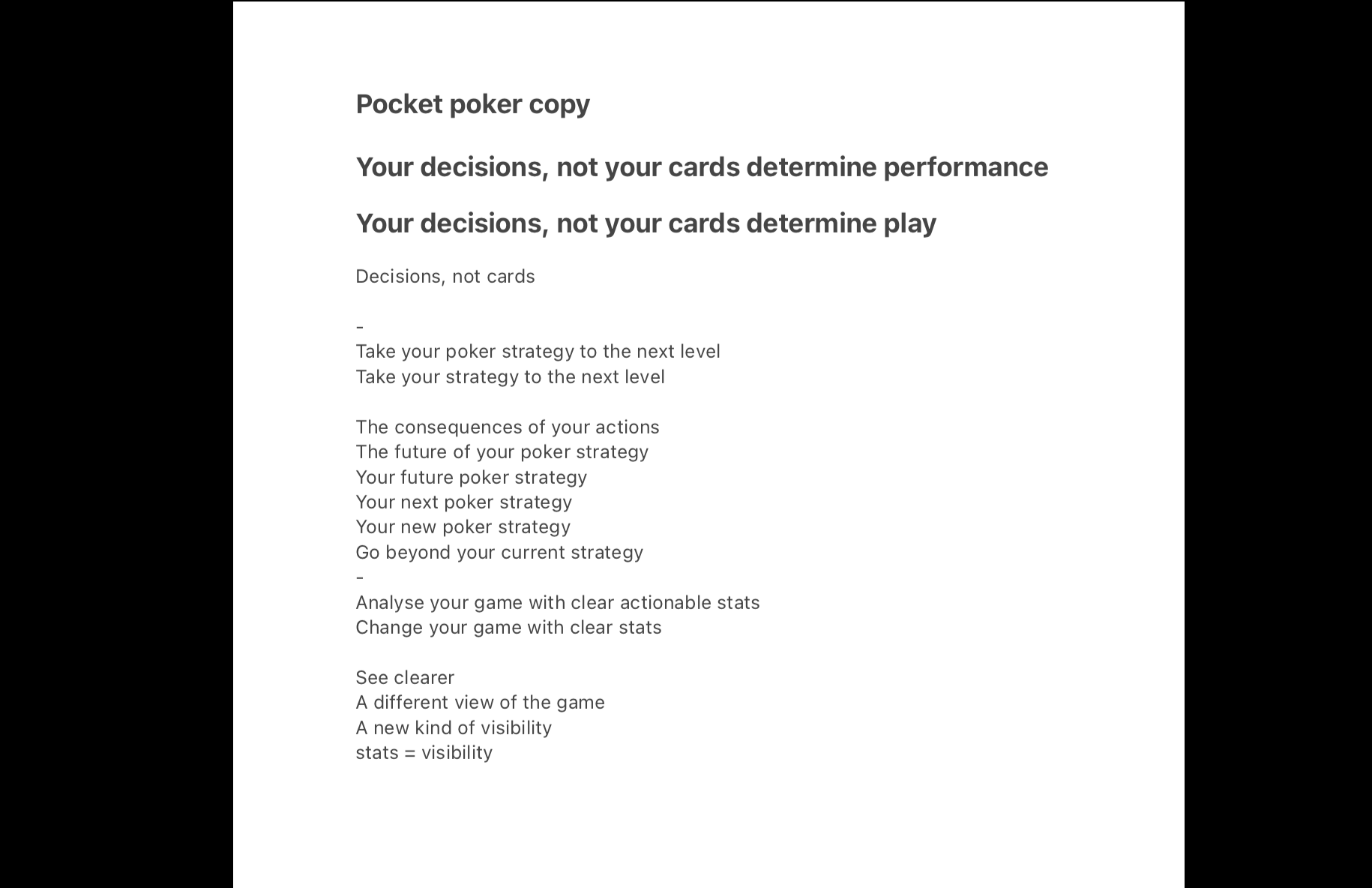
A lot of the original copy used a lot more words than necessary to make each point. I therefore stripped many of the phrases back to their essentials.
Simplify
Spatiality
As humans, we often process information by relating it to a sense of space. This helps us to visualise the relationships between abstract concepts in the same 3D way that we process information about the world around us.
I decided that some of the concepts could be expressed in ways that make intuitive sense to us in a way that we feel rather than intellectualise.
Put simply: what does this statement actually feel like as an experience?
These were the main changes that I settled on:
Changes
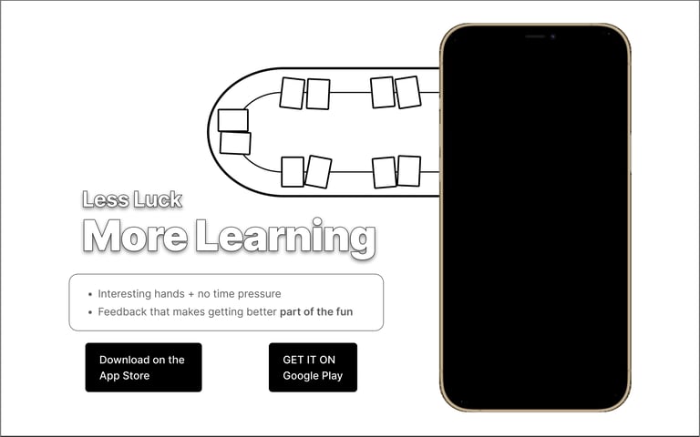
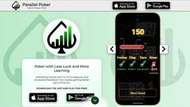
Poker with Less luck and More Learning → Less luck, More Learning
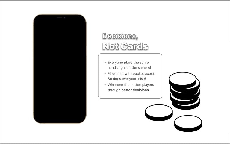
Your decisions, not your cards determine your performance→ Decisions, not cards
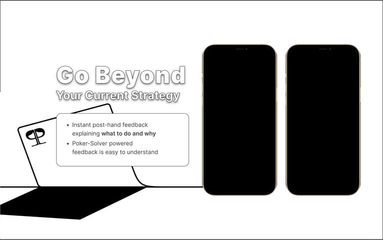
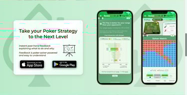
Take your poker strategy to the next level→ Go beyond your current strategy
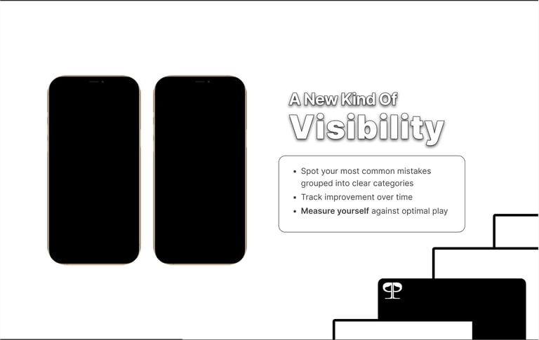
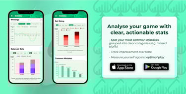
Analyse your game with clear, actionable stats → A new kind of visibility
Got a question → Any Questions?
I also felt that there was a lot of excess that could be trimmed off the rest of the copy too, so I also simplified that down to its essential elements.
Other Text
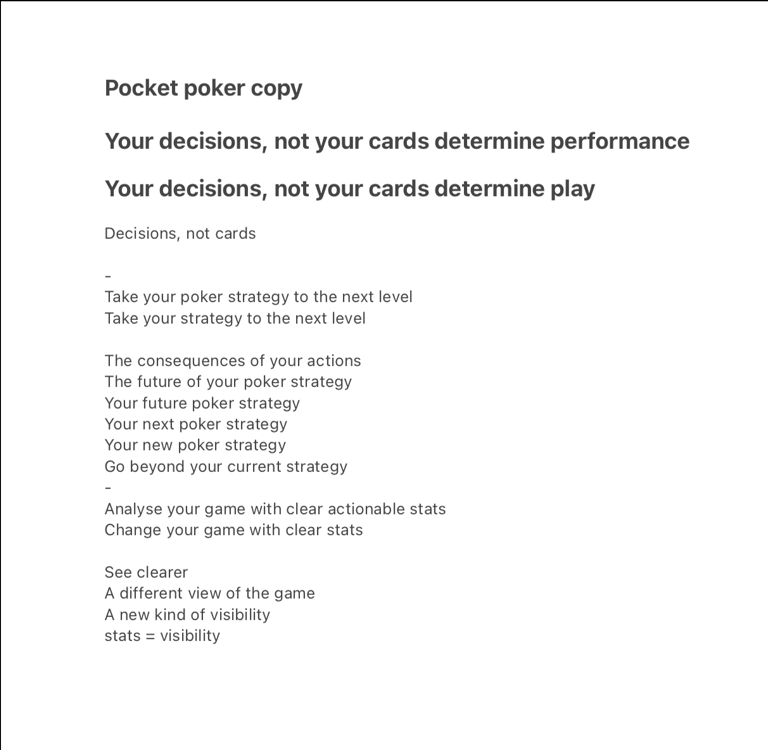
Here I have included one of the mock-ups so that you can compare my suggestions and see them in context
Copy in Context