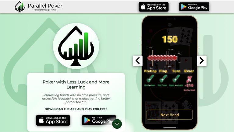
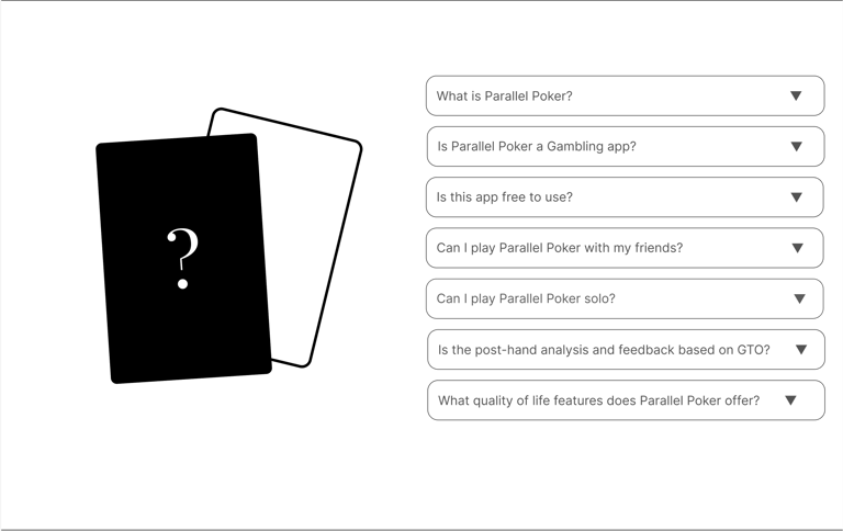
Parallel Poker
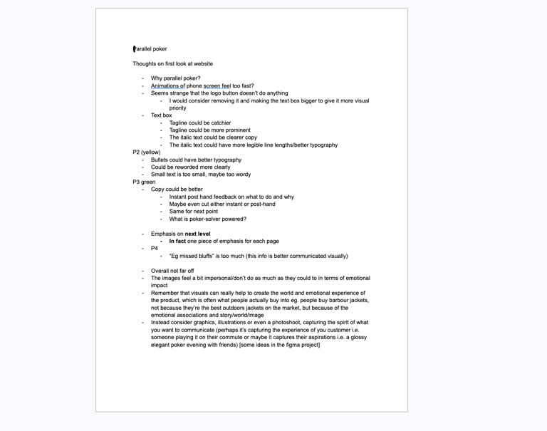
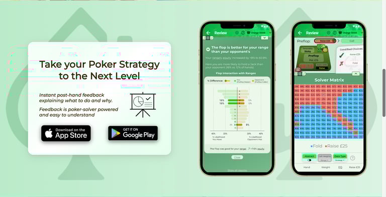
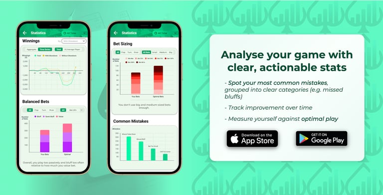
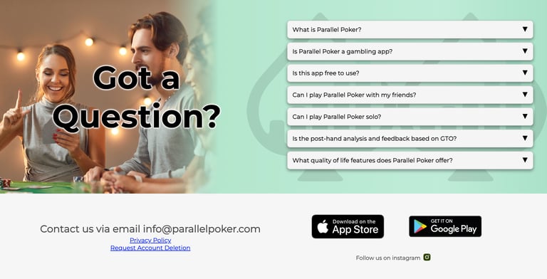
Parallel Poker is an app that improves your poker playing by analysing your decisions and comparing them against all the other possible alternatives on the same hand. It does this with Poker Solver technology and represents a new approach to Poker apps.
I gave some advice on web design and branding in February, to help them appeal to their customers and present their product in a light that emphasised its appeal.
Background
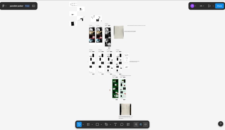
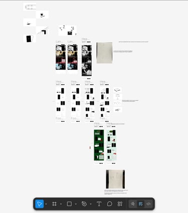
I started by going through the website, making notes of the big things that stuck out to me.
Notes
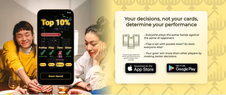
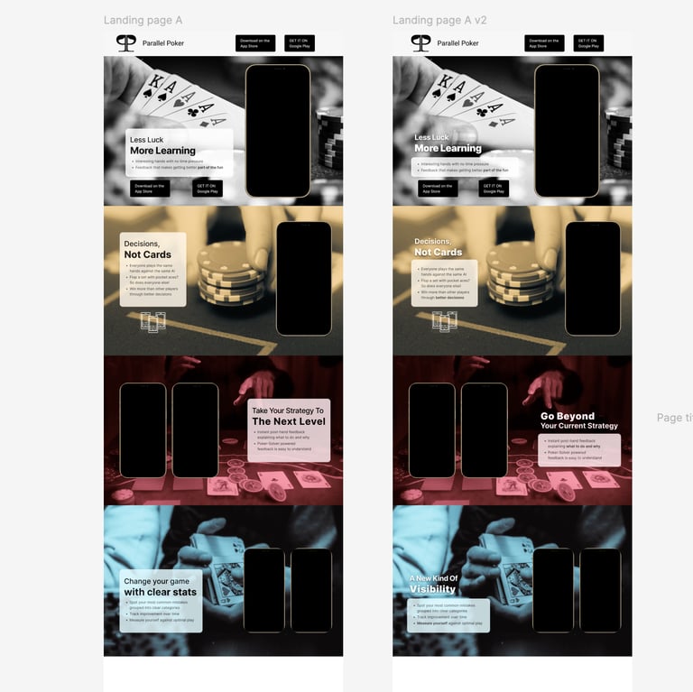
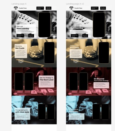
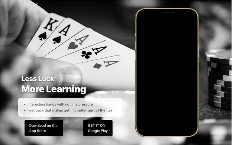
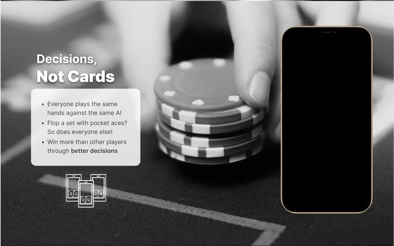
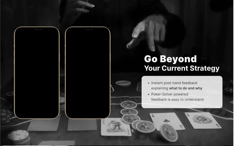
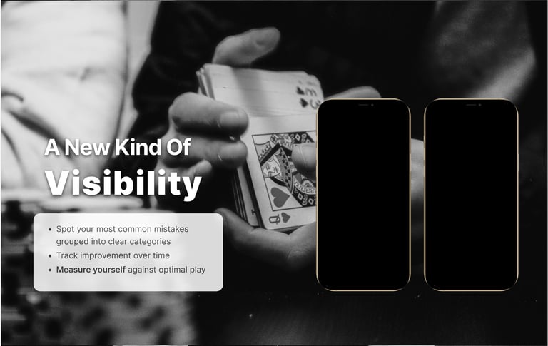
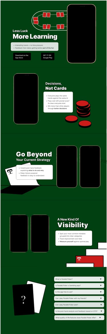
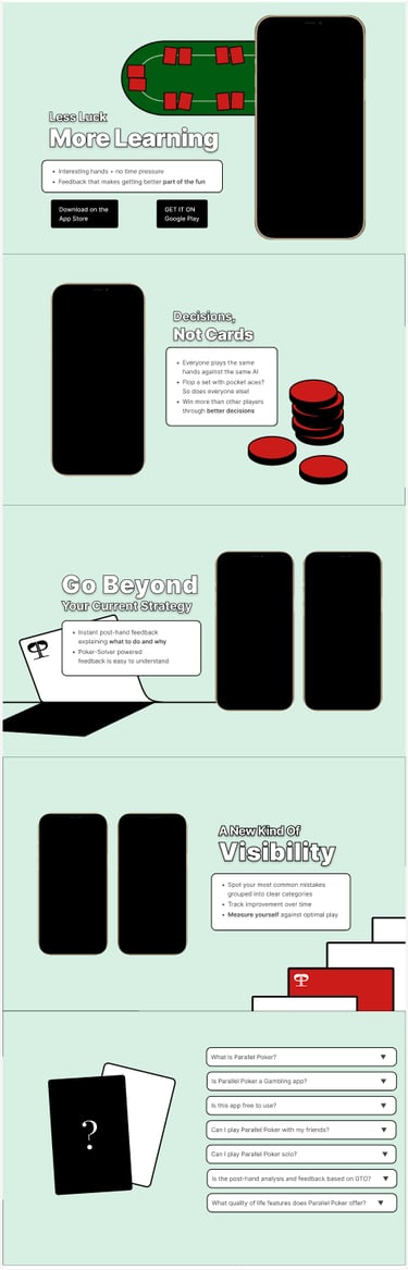
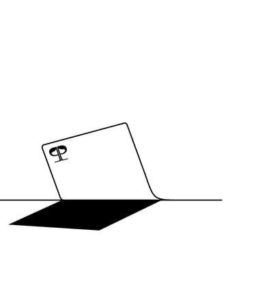
I thought that a major change could be made through the choice of images, as this really creates the feel and the experience of what the app would be like. I particularly wanted to capture the glamour and sophistication of a poker evening. I edited some stock photos to be black and white and also cropped them to draw the eye in visually. I also worked on the typography and layout over a few revisions and while initially I went for different colours for each page I decided to drop this.
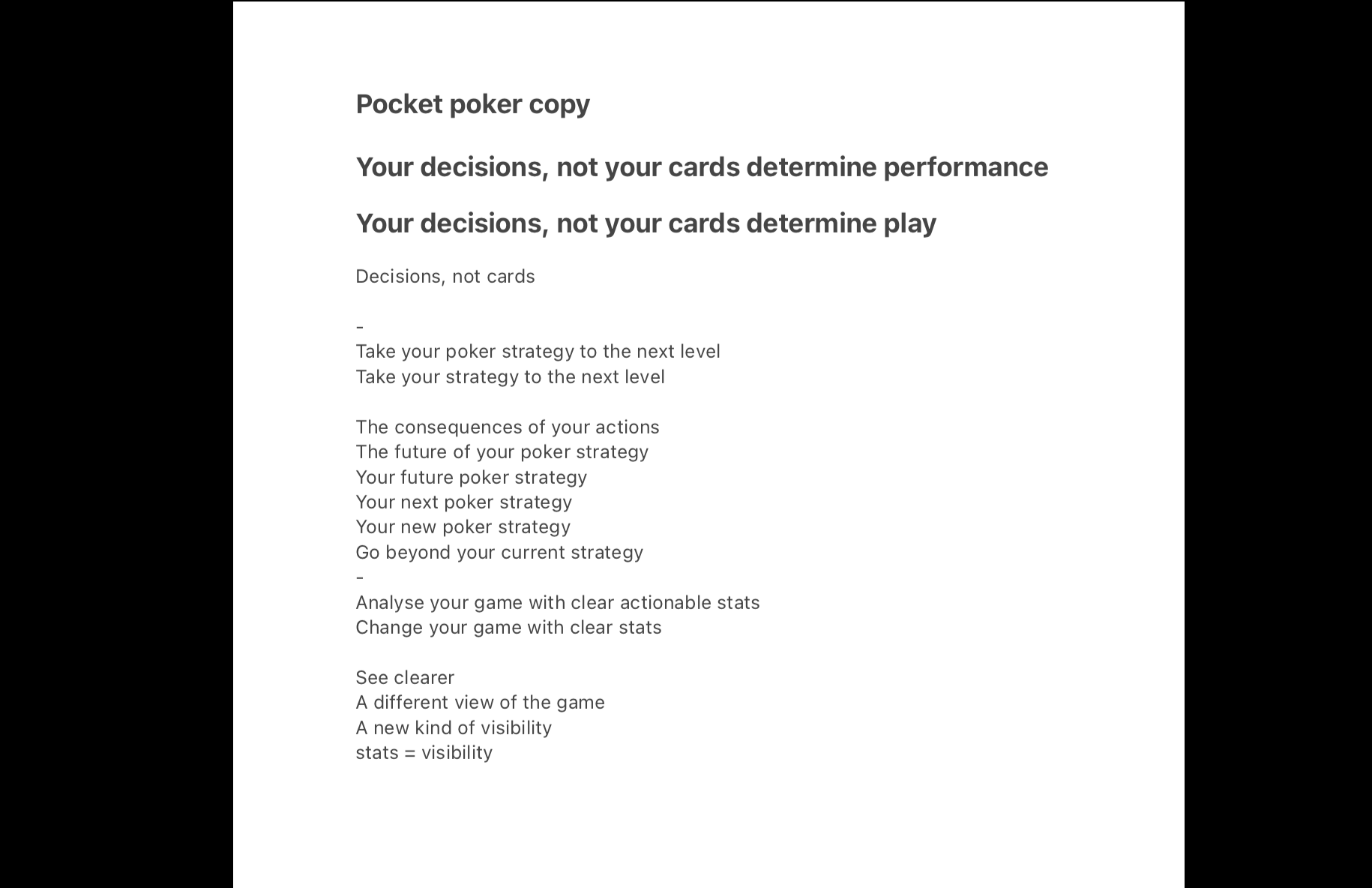
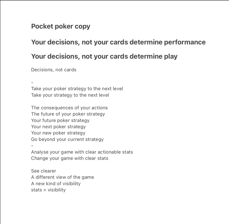
I also revised a lot of the copy, particularly the titles. You can find out more about this process below:
Idea A
Creative copy
The ultimate form of this idea would be to do our own photoshoot rather than making stock images work.
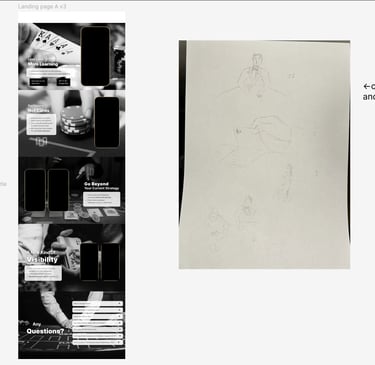
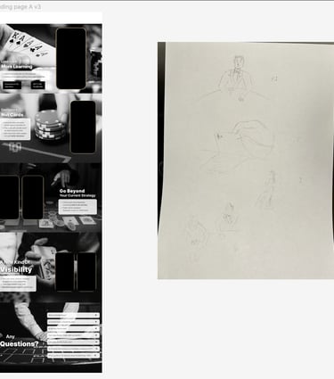
Idea A Photoshoot
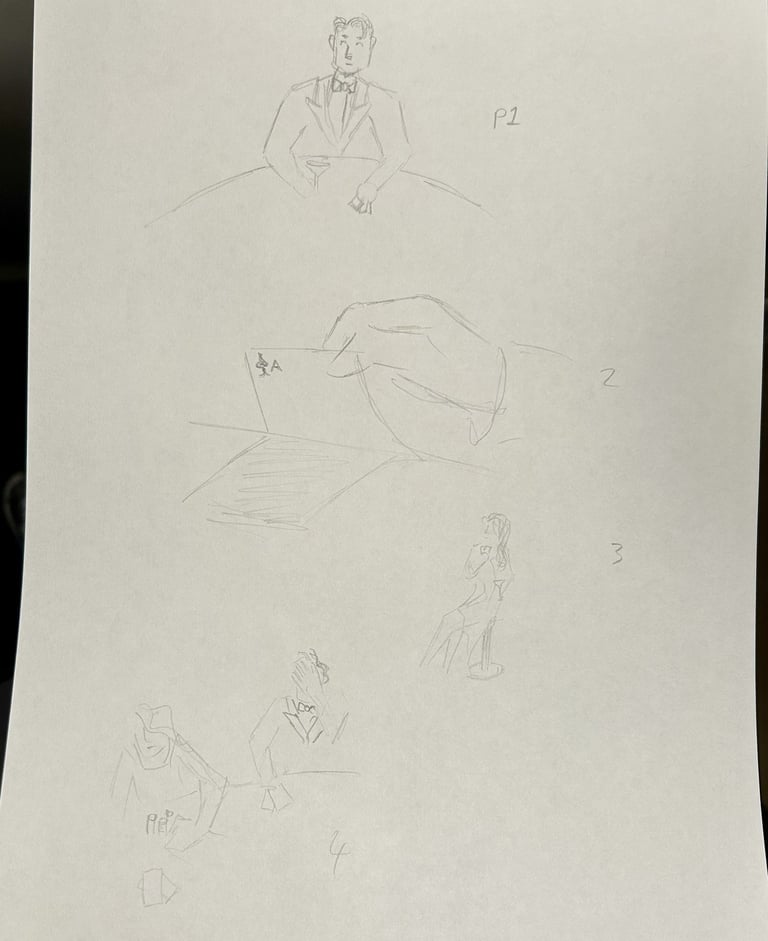
I asked myself,
"why would someone download this app?"
"what would the picture of the end goal look like?"
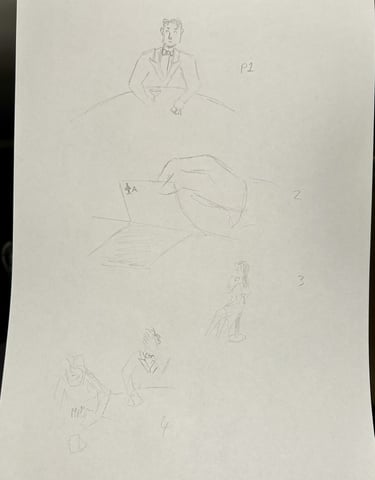
The dream for most users would be sitting down at poker evening with their friends and really enjoying themselves.
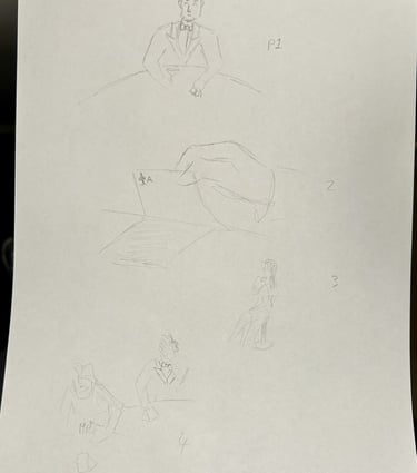
I also wanted to capture some of the glamour and sexiness that draws people to poker, and I also wanted to convey some of the sophistication of this app's technology, so I was inspired to go for a Casino Royale 007-esque style which would appeal to the coolness that people aspire to when learning poker.
These are my sketches to illustrate my intentions.
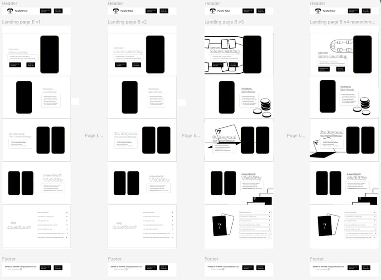
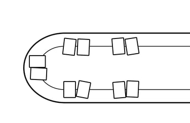
For a second idea I wanted to see what a graphic visual style would look like. I also thought that clear symbols and clean lines could be a benefit for visual communication as well as appearing safe and trustworthy. I started with the layout before introducing graphics and ultimately did 4 drafts.
I then did two colour versions, one in a calm pastel and the other in the greens and reds that I associate with poker table felts.
Idea B
Different versions
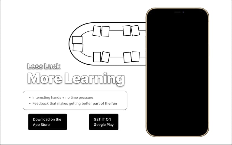
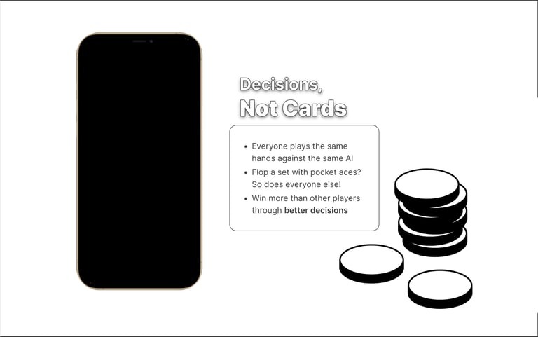
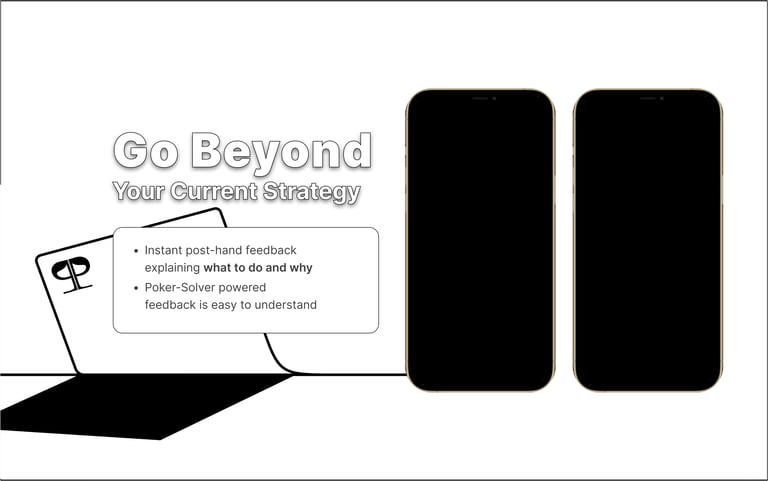
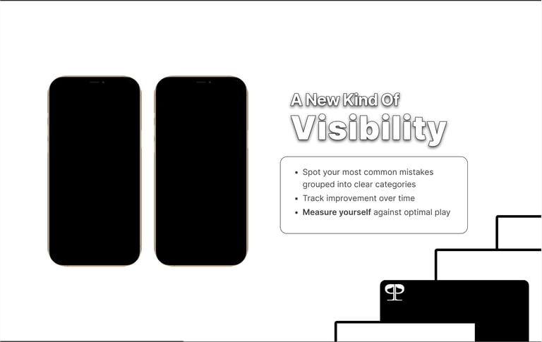


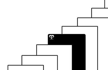
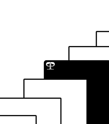
I created all the graphics in Adobe Illustrator, and I aimed to represent visually the intention of each page using poker imagery. I also included logos on the cards.
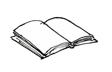
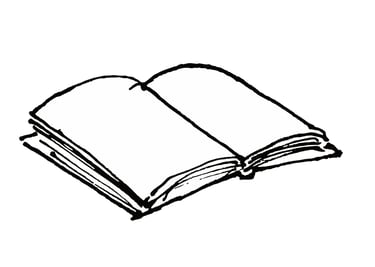
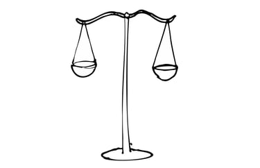
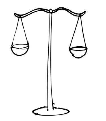
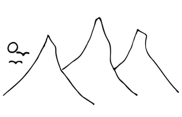
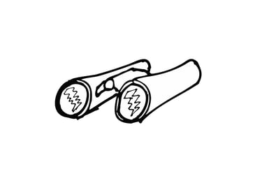
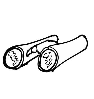
As an alternative I also roughly sketched an alternate set of graphics which were more abstractly related, instead symbolising each page i.e. a book for "learning", scales for "decisions", distant mountains for "going beyond", binoculars for "visibility.
Idea B's Graphics
Alternative graphics

For my third option, I wanted to present something different. The first two ideas were fairly straightforward logical ideas, so I thought that for third, why not present something a bit more out there and that's also much more "me".
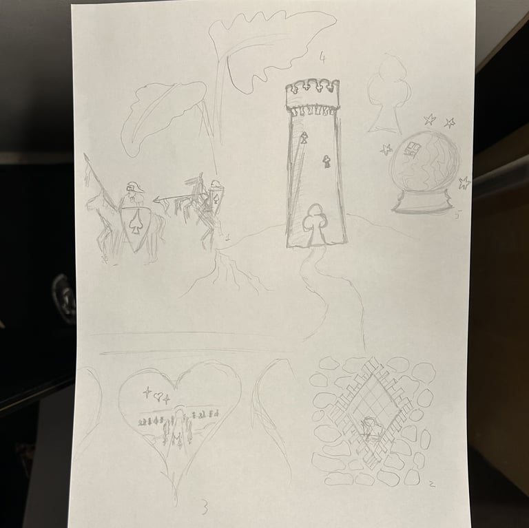
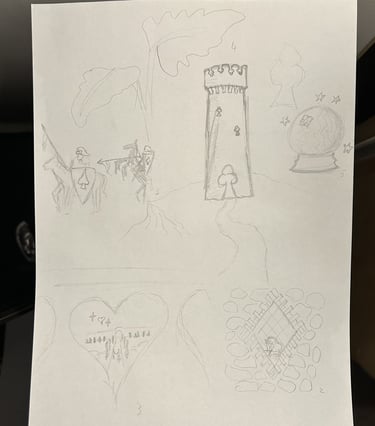
I decided to lean into the idea of expressing fun so I decided to create 5 whimsical scenes that that represent each page but also thematically represent each suit ie. A knight on a rearing horse, a lady writing through a window, lovers walking through gardens into the distance, a tower and a crystal ball.
Idea C
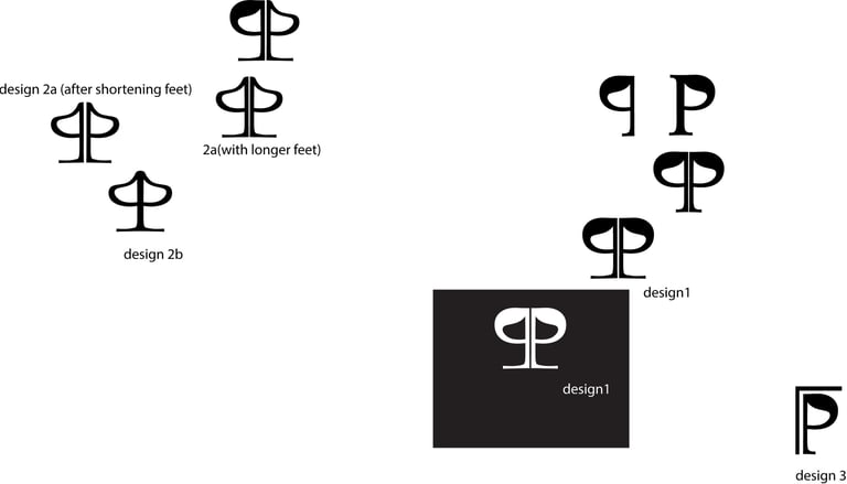
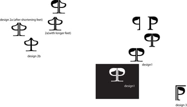
I was primarily inspired by the themes of parallelism and the fact that the initials were P.P.
I also liked the idea that these could create an overall shape that is similar the iconic symbol for spades, which is heavily associated with poker already.
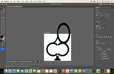
I did two designs along these lines, and a third which instead uses the corner of a playing card as it's inspiration, also incorporating parallel lines and the spade shape into the P.
Logos/Branding
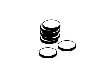
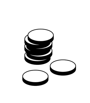
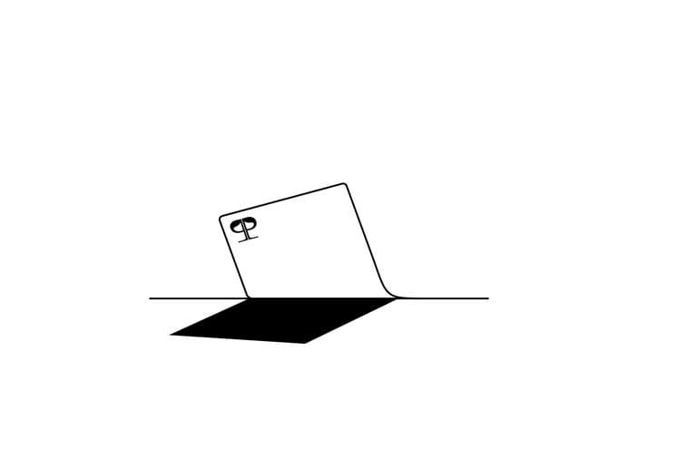
We met up for coffee, and I presented my feedback, and then my ideas for taking the website forwards. As we went through each idea, I got a greater sense of what the client wanted i.e. he didn't want depictions of gambling or money, he liked the idea of capturing the coolness/depicting that aspiration for most user. He also liked the improvements to the copy.
Discussion with client
Of the ideas, he liked the photos best and agreed that capturing the coolness and the aspiration of the users would work well.
Photos
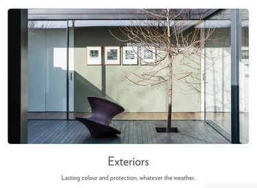
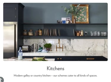
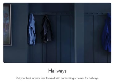
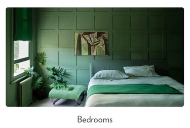
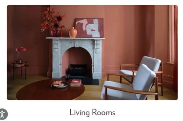
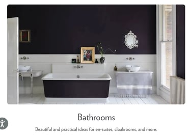
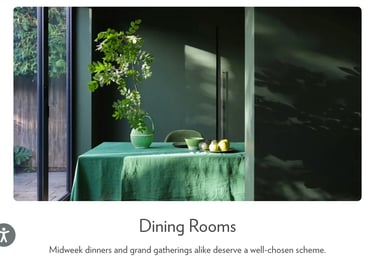
The client explained that the colours on the website were linked to the colours in app, which visually serve to make each type of page distinct. We talked a bit about the impression that colours give and that a new colour scheme could appear more sophisticated. I also offered that you could treat the experience of navigating the app like walking through different rooms of a house. This lead to the suggestion that we could use inspiration from interior decoration, such as these recommendations from the Farrow and Ball website.
Colours
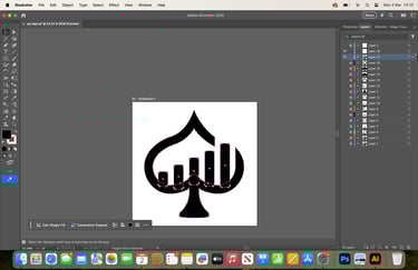
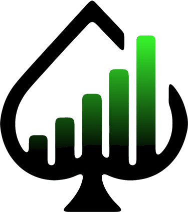
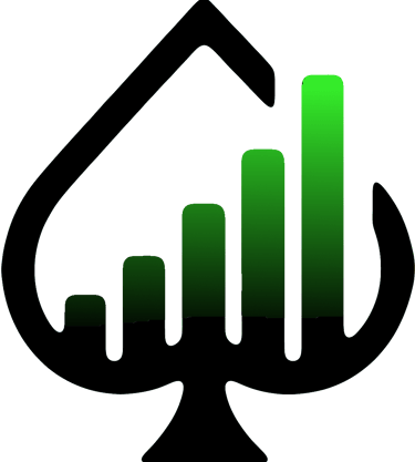
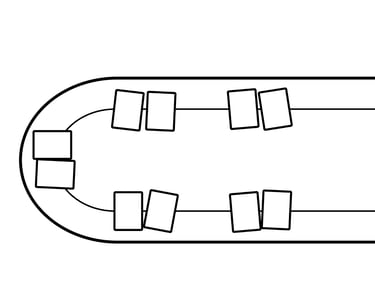
The client found the logo redesigns interesting, but ultimately preferred the ideas behind his current logo. This was partially that he preferred the graph representing progress as well as the idea that they were also parallel lines.
Logos


The current colour scheme was chosen to represent safety and calmness.
The client thought that the photoshoot idea would be ideal, however at this stage he didn't have the time or budget at the moment. In the meantime, he proposed that some carefully selected stock photos could be good enough for now; in particular, photos that don't show gambling but capture the fun and relate to each page/slide.
Going forward

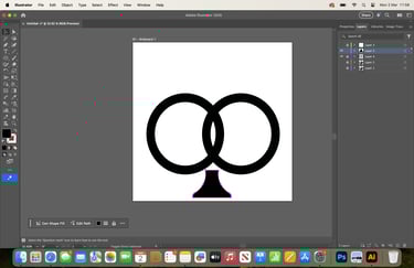
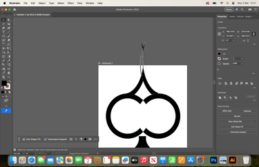
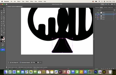
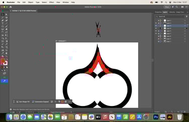
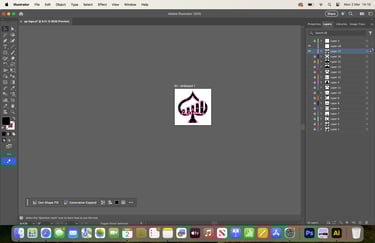
I did a redraw of his current logo using illustrator with the intention to make the ace shape clearer with a curvier classic design. I also wanted to make the spacing of the bars and other elements more harmonious, proportionate and symmetrical.
I also created several different versions in white black and their respective outlines.
Logo Redraw