Tequila Sunsets

I wanted to give it a summer evening setting as this is where the song happens, and Battersea power station is a nod to the area. The clock on the cocktail fruit was set to the early hours of morning to allude to the last entry times of the establishment alluded to in the lyrics and also to add to the surrealness of the setting. I then mocked up a first draft on Illustrator at the Roundhouse Studios in Camden, which I didn't complete before closing time.

From the outset, I knew that I wanted a sunset in a cocktail glass as the central motif in this cover art. Even before I started sketching I had started visualising the song's title in my mind's eye. I then sketched out a few iterations of this design, trying to work out how I wanted to depict the cocktail glass and working out simply some of the other elements of the composition, like the moon and stars, a cocktail fruit with a clock on it and the outline of Battersea power station.

Beginnings

Setting

When I got home, I looked at my first draft critically and decided that it wasn't really what I meant. So I did some more sketching to try and figure it out, and took some cocktail glasses out of the cupboard to analyse their size and shape, and realised that my bases were too wide.

I also took some colouring pencils to try and work out the colours, and I considered some other elements like a hand on the side and placing the cocktail orange on the side next to the glass. I also added some details like birds to flesh out the sunset in the glass, and also a glint of light to the glass itself.

Analysis

Sketching

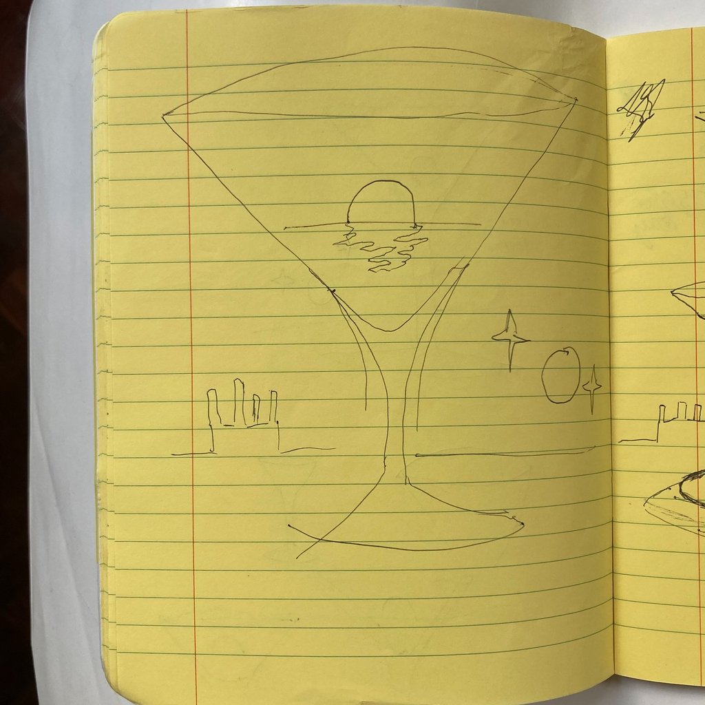
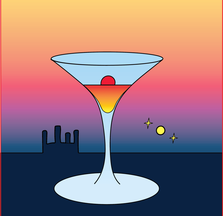
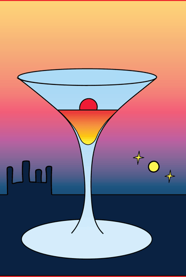
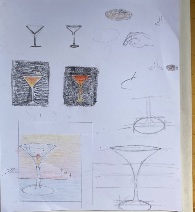
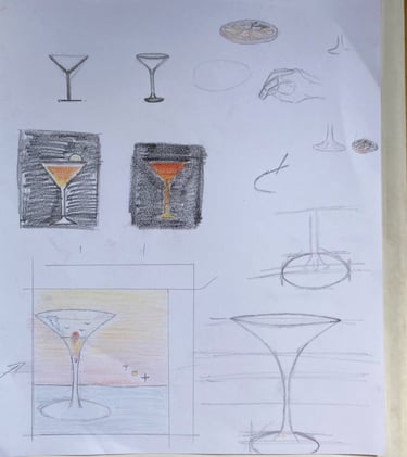
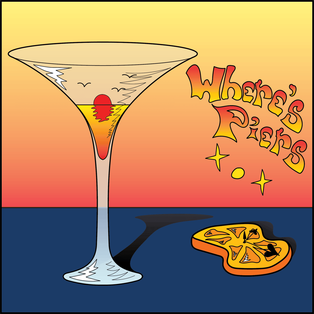
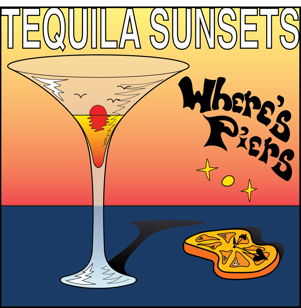
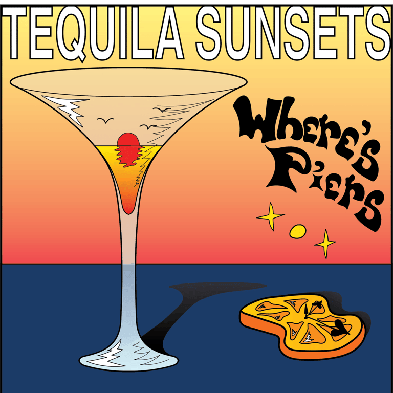
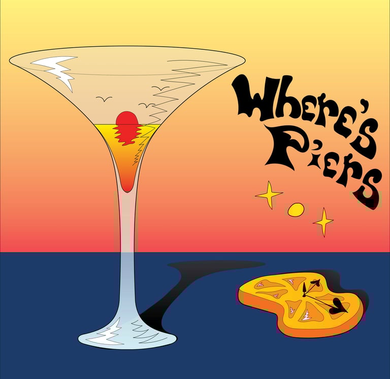
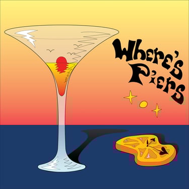
I then went back in the following day and drew up the new design in illustrator. I also added shadows and distorted the orange-clock to heighten the surrealness, and also as a nod to Dali, whose art I greatly enjoy. I also gave the glass a stylised transparent quality with a gradient, which helped give it a realness in the context of the style of the scene. Both this and the shadows also helped to give the work more of a 3D quality.

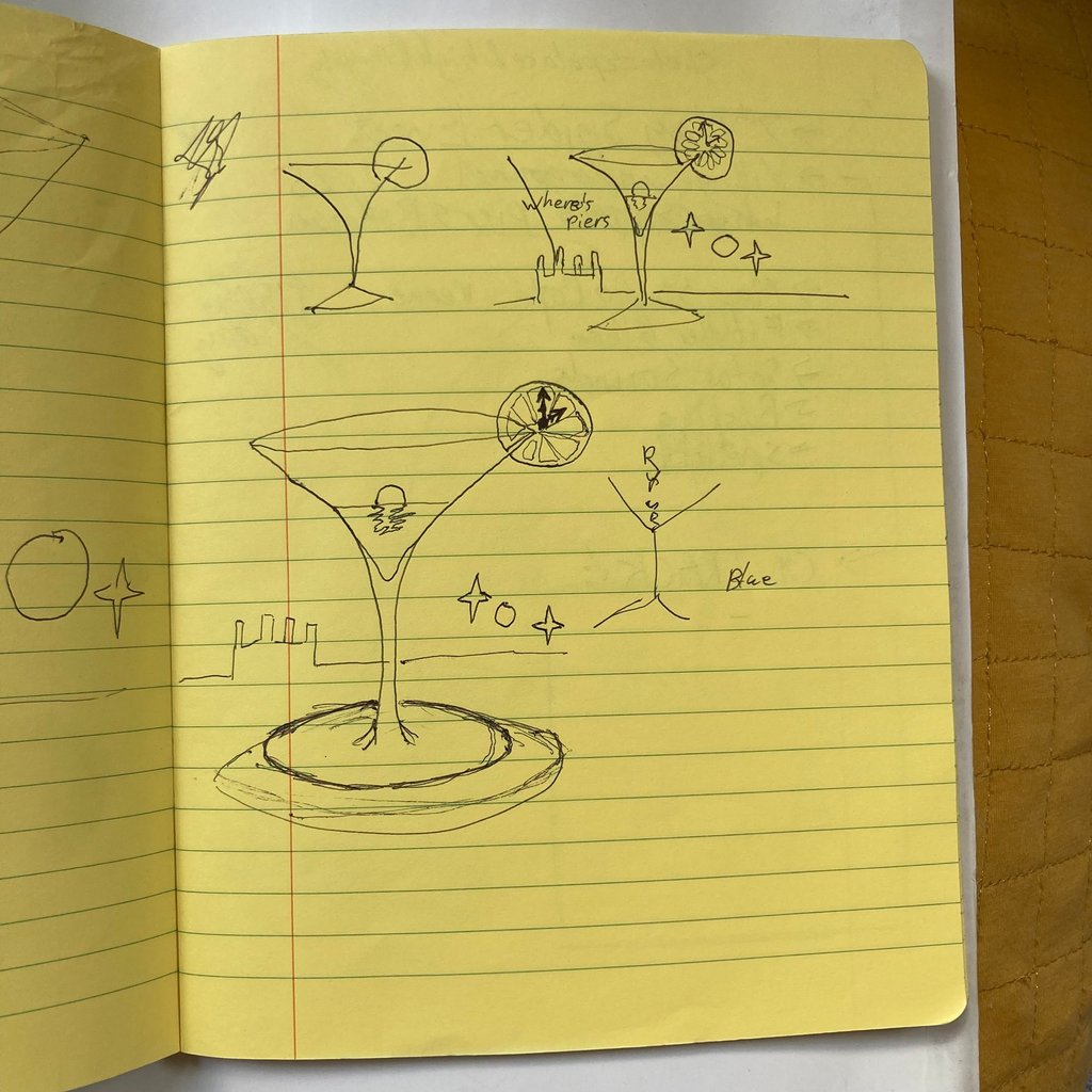
Finally, I scaled the artwork up for higher resolution, so then I experimented with different line weights, ultimately settling on a more naturalistic, thinner weight.

My next step was to add in the text, and I decided to draw a sort of droopy, fluid, bubble-writing that alluded to both 1960's and Art Nouveau styles, which fit both the style of the track and the emerging aesthetic of this project as a whole. This was also actually the first appearance of my project name depicted in this way, which afterwards became my logo as I liked the style so much (after a few tweaks). I tried a few alternatives to the solid black that I ultimately went with, and also played with the idea of including the song name, however, I decided the art communicated that well enough so it was superfluous.

Re-draw

Type

Scale