Parallel Poker
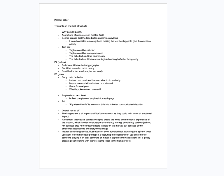
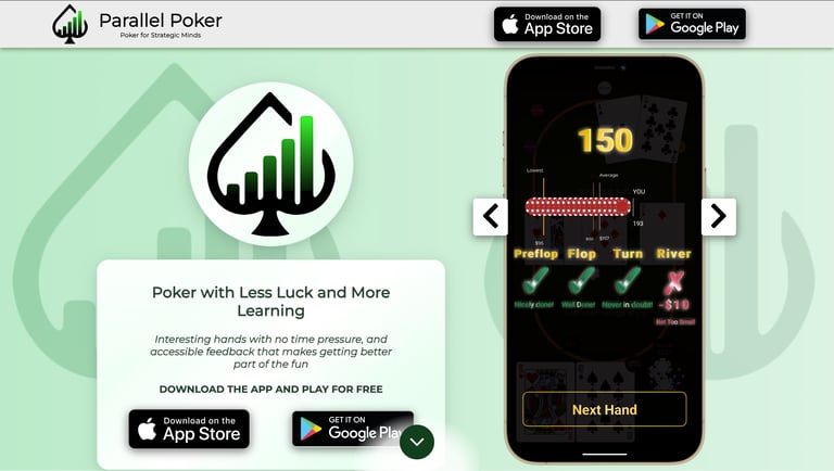
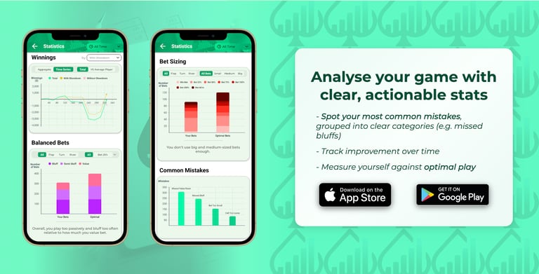
Parallel Poker is an app that improves your poker playing by analysing your decisions and comparing them against all the other possible alternatives on the same hand. It does this with Poker Solver technology and represents a new approach to Poker apps.
I gave some advice on web design and branding in February, to help them appeal to their customers and present their product in a light that emphasised its appeal.
Background
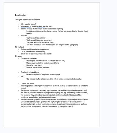
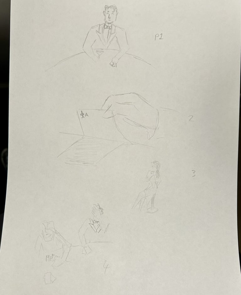
I started by going through the website, making notes of the big things that stuck out to me.
Beginning
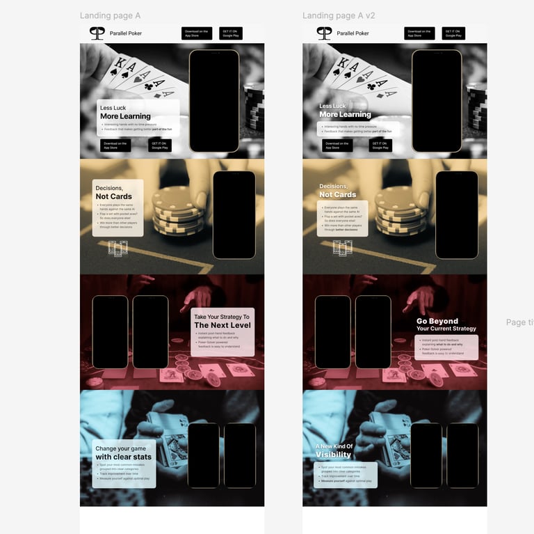
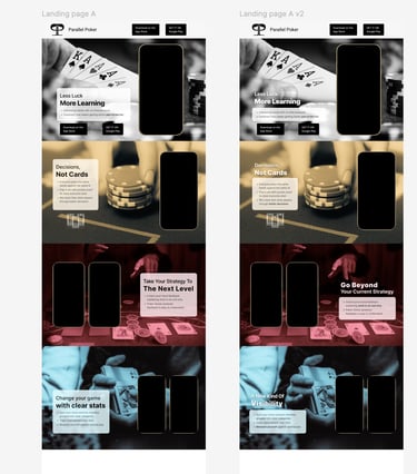
I wanted a very restricted colour palette for three reasons: visual clarity (inspired by the rule of tincture in heraldry), ease of printing and flexibility, and also a less-is-more overall approach.
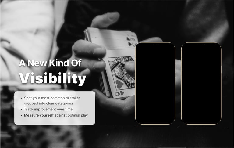
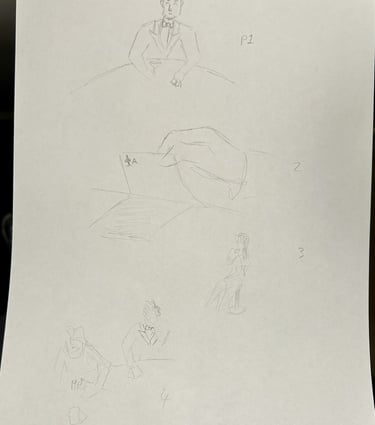
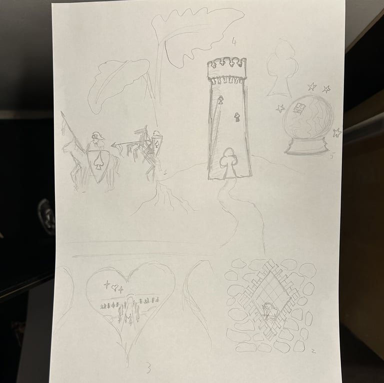
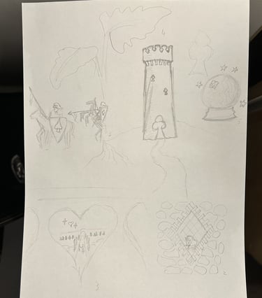
Talk about decisions picture below of draft copy
link to page in writing that goes over the copy in detail
Idea A
Creative copy
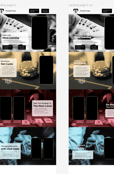
I imported the graphic into InDesign first, then assembled all the pieces of information following the rough idea from my notebook.
I wanted to go with a serif font for a number of reasons including elegance and also a desire to get away from the omnipresent Helvetica that we see everywhere. I chose Playfair Display which is based on 18th century display fonts, and felt like clear and elegant choice.
Idea A Photoshoot
I wanted a very restricted colour palette for three reasons: visual clarity (inspired by the rule of tincture in heraldry), ease of printing and flexibility, and also a less-is-more overall approach.
Graphics/Colours
Idea B
Different versions


I wanted a very restricted colour palette for three reasons: visual clarity (inspired by the rule of tincture in heraldry), ease of printing and flexibility, and also a less-is-more overall approach.
Graphics/colours
Idea B's Graphics
Different versions
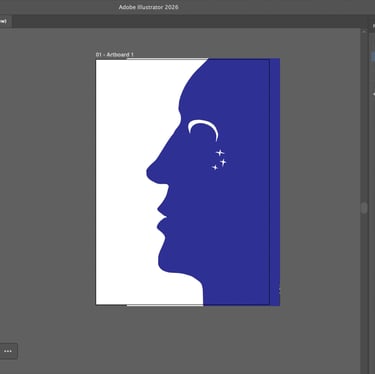
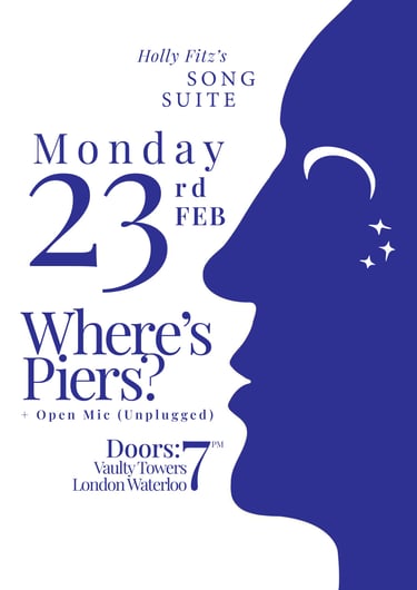
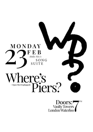
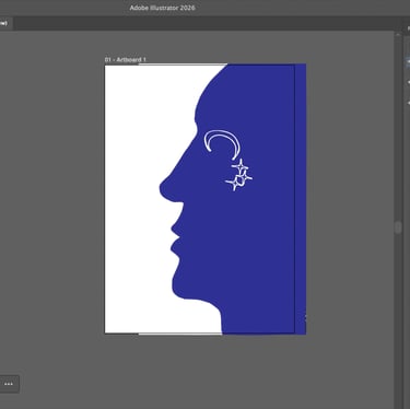
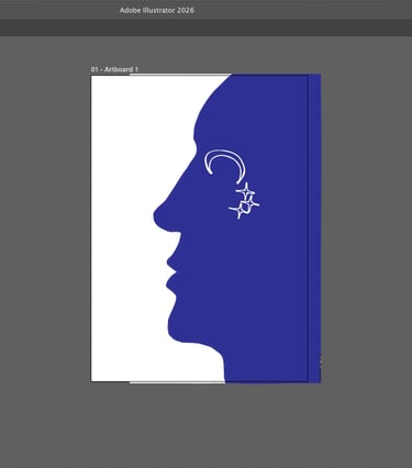
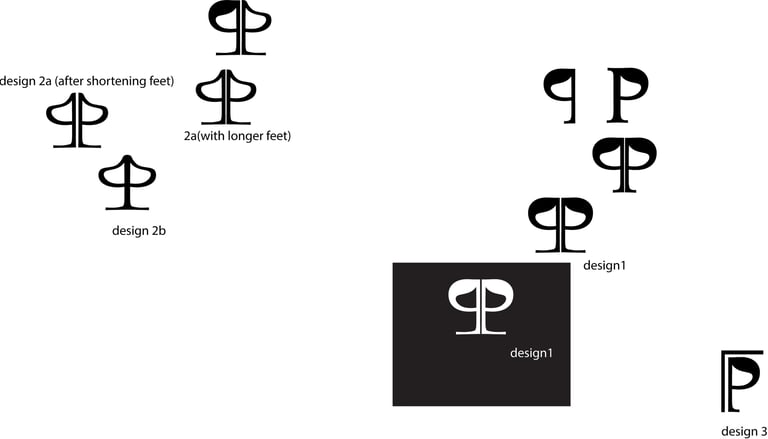
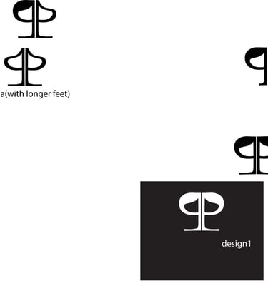
This monogram design is a device that I came up with when I first started this project. The intention was to create a symbol that could easily be drawn by anyone, and I was inspired by the band logos that I used to doodle in my exercise books at school. For this usage, I wanted to depict it in a way that was reminiscent of the brushstrokes of caligraphic scripts, particularly ancient Chinese scripts. I did a page of variations with a few different marker pens, and then chose the closest one to my intention. I then image-traced it in Illustrator.
Idea C
I imported the vector into InDesign, and then copied over some of the groups from the other poster version. I kept broadly the same typography as I was happy with the way it looked, but I rearranged the layout to echo the form of the monogram graphic. For me, a big inspiration for the layout of this poster variant was the Swiss School Style, particularly a 1956 poster by Emil Ruder for a Japanese calligraphy exhibition and a 1959 poster by Armin Hofmann for a Max Gubler exhibition.
Logos/Branding
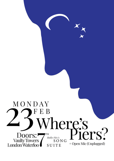
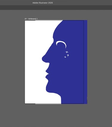
I ran my designs by my brother for an outside perspective over lunch, and I figured out that the face/night graphic had more intrigue than the monogram. However, I also figured out there were issues with the layout that meant that the information wasn't quite as clear as it could be.
I sat back down after lunch and re-ordered the text to find new ways to get it to fit together, letting go of some of my original ideas. Because the result ended up more horizontal, I decided to take inspiration from theatrical and travel posters (such as vintage ski posters) which often place the image at the top to draw in the eye.
Discussion with client
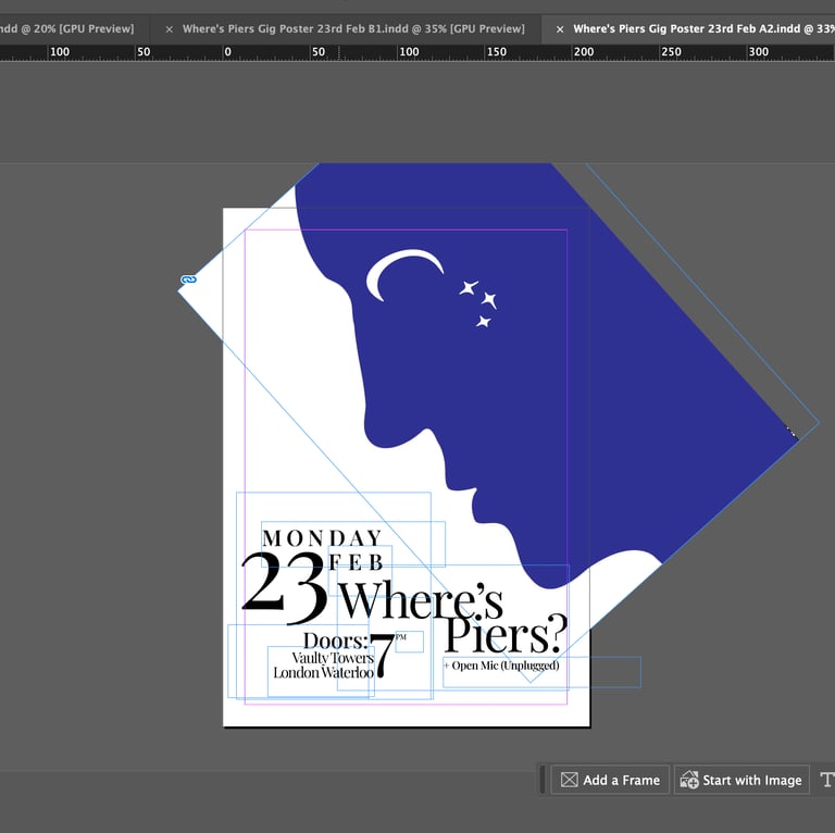
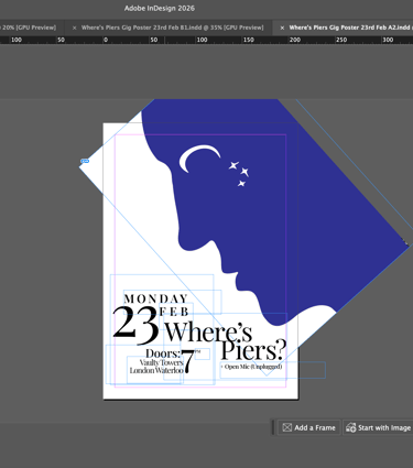
I also rotated and zoomed the graphic to make its dual image clearer and also to make the face interact with the text. I also found this new composition more pleasing, as by losing some aspects of the design to the crop, it changed the focus ultimately adding to the experience.
I ran my designs by my brother for an outside perspective over lunch, and I figured out that the face/night graphic had more intrigue than the monogram. However, I also figured out there were issues with the layout that meant that the information wasn't quite as clear as it could be.
I sat back down after lunch and re-ordered the text to find new ways to get it to fit together, letting go of some of my original ideas. Because the result ended up more horizontal, I decided to take inspiration from theatrical and travel posters (such as vintage ski posters) which often place the image at the top to draw in the eye.
Going forward
I also rotated and zoomed the graphic to make its dual image clearer and also to make the face interact with the text. I also found this new composition more pleasing, as by losing some aspects of the design to the crop, it changed the focus ultimately adding to the experience.
I laid out the three versions on the table, and decided that the final one (right) was the strongest implementation of my intention, so I decided to go forward with this one and get it printed.
Logo Redraw