One (Pt. 1)

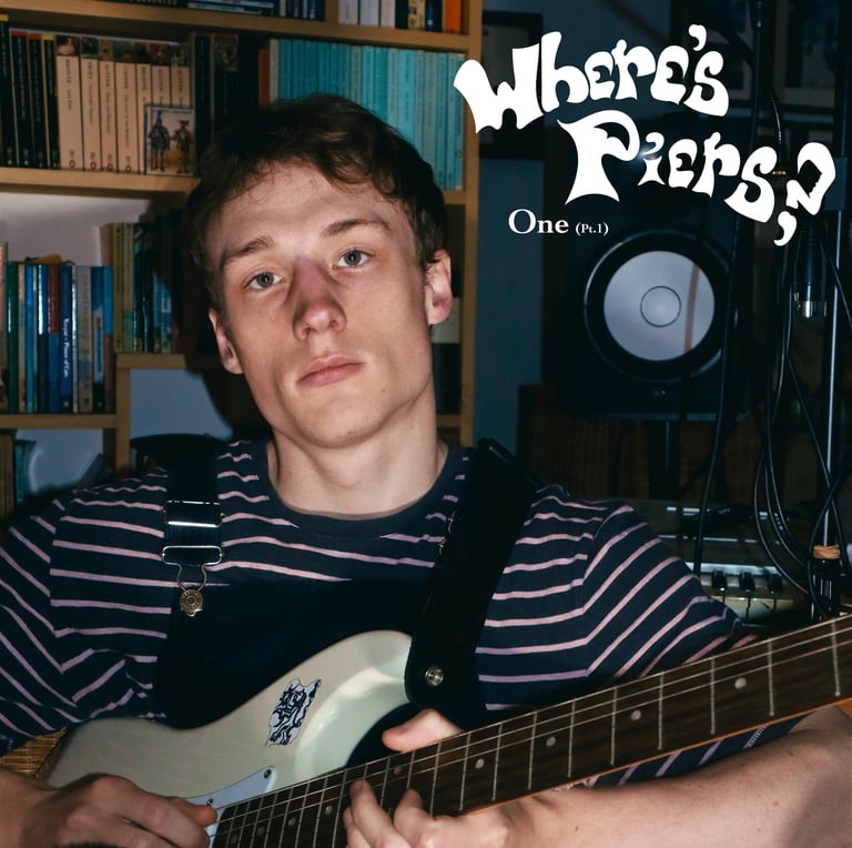
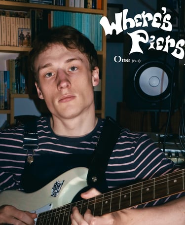
I did the colour for the picture in my video-editing software rather than a photo editor, because I wanted to use the same basic colour grade that I had used in my music videos, in order to create a coherent aesthetic across media.
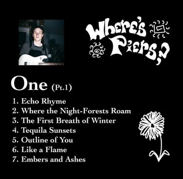
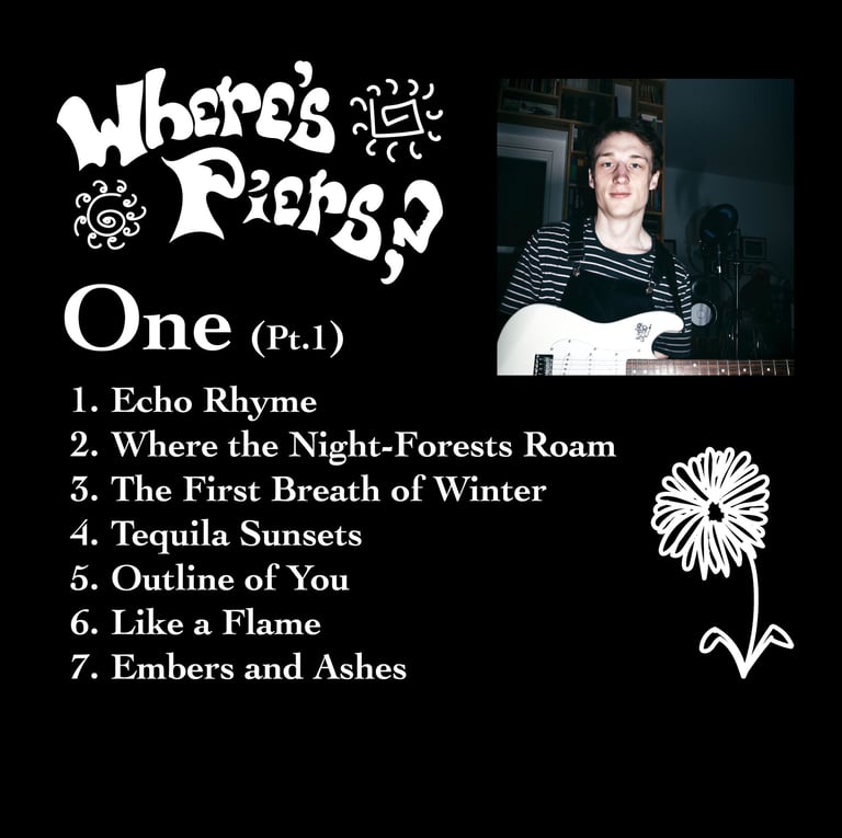
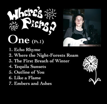
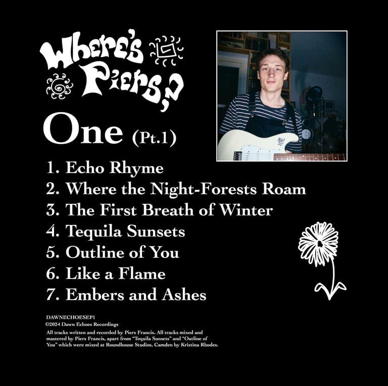
I added my Logo over the speaker cone of my monitor, echoing its shape. I also placed the name of the EP below to the left, using a simple serif font for its honesty and made the "pt 1" smaller to emphasise the focus: "One", with the principles of visual hierarchy.
Direction
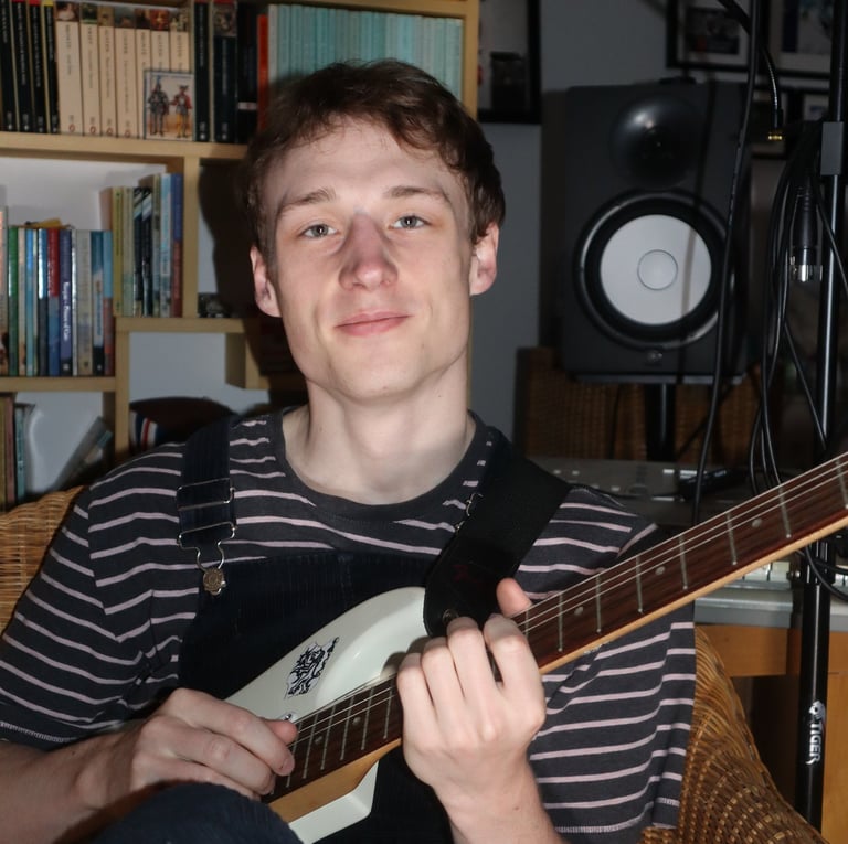
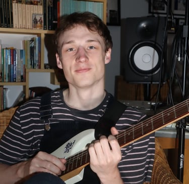
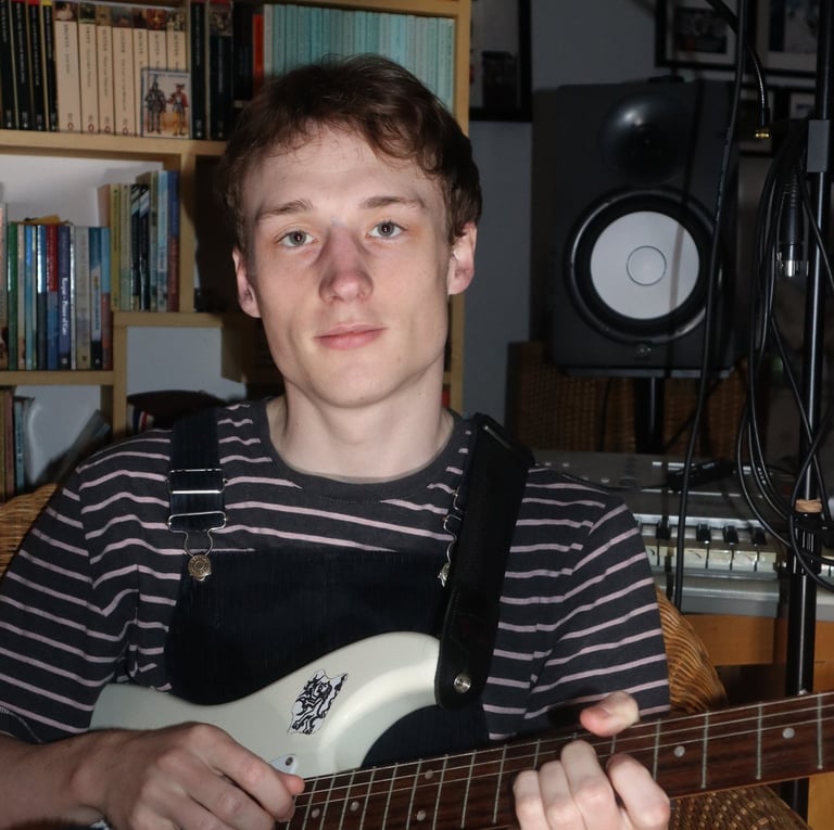
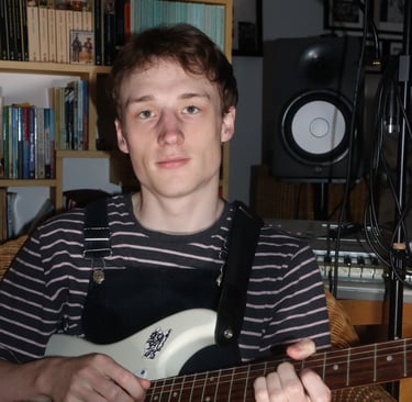
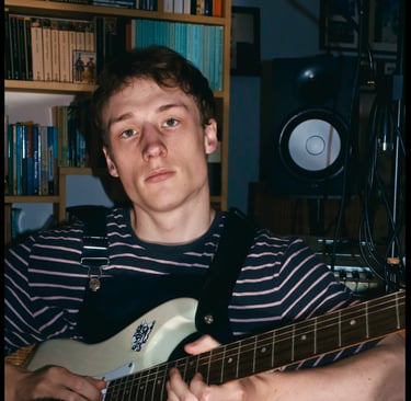
For this cover art, I wanted to bring the listener into the space where I created the record. I really to create a sense of intimacy and show something that was real.
Authenticity
I posed with my guitar, showing the sticker I made of a symbol that holds a lot of personal meaning, which added to this statement of artist identity. I tried a few poses before settling on the one that I thought fit best. For styling, I chose dungarees and a striped t-shirt for two reasons, firstly that it fit with the aesthetic of the project and secondly, it was a nod to my inner-child whose curiosity helped shape the record.
I did a little photoshoot at my desk at home, with my keyboard, mic stands and monitors in the background. I set up my camera on a tripod with a self-timer, and lit the scene with some lamps only which were stationed by the camera to create the intimacy and the honesty that I wanted.
Styling
Editing


It took me longer to work out a clear vision for the rear cover, (which I needed once I decided to get CDs made). The main challenges lay in conveying the necessary information in a way that wasn't just functional, but also enhanced the visual appeal. My first few drafts were functional and had some nice elements, but ultimately weren't particularly eye-catching, so I went back to the drawing board and dug out all my parents' old record sleeves to analyse how they worked.
Rear

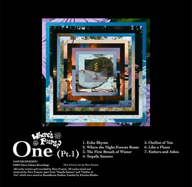
One of the first things that I realised was that I hadn't used enough of a visual hierarchy in the text. I also needed to balance the use of space more towards a striking image, as this would comunicate a quicker, more definite emotional reaction than the text. I mocked up a series of ideas, so that I could compare them with the one I thought worked best.
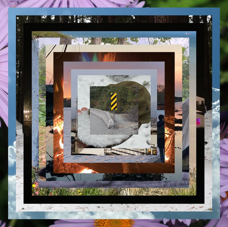
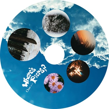
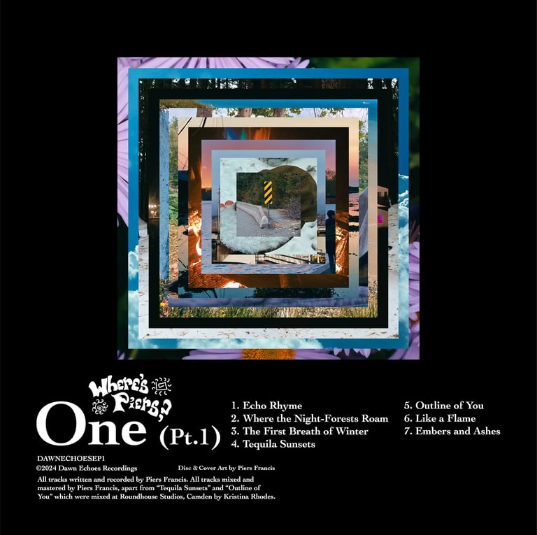
My third idea was a development of the idea to represent my own journey that led to the making of the record, so I took a number of photos from the previous couple of years, insetting them into each other as frames, or moments, to create a sort of tunnel through time representing the trajectory of my actions, leading to a road sign out in Canada which represented the moment of "stop, turn back" that I came to before returning here, to create the record. Ultimately, while they were all visually striking, I decided that the third idea felt the most like the journey that I went on to make the record, so I went with that one.
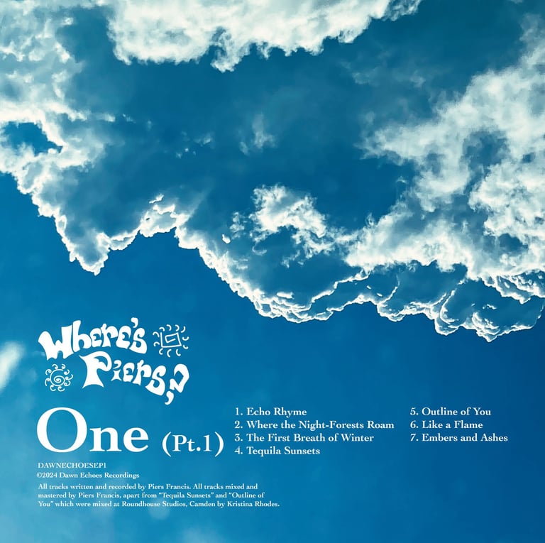
My second idea went in a slightly left-field direction, using an all-encompassing image of the sky, with the shape of the clouds following the outline of the text.
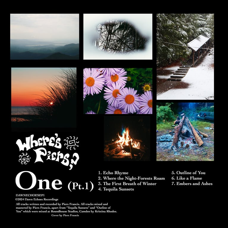
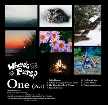
My first idea involved a photo for each song, representing it symbolically, all taken by myself over the previous few years (representing the journey of creating the record).
Impact
Idea 1
Idea 2
Idea 3