Life Soup
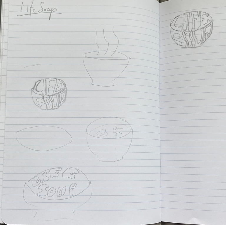
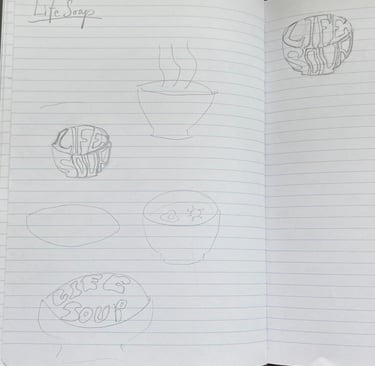
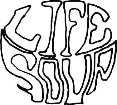
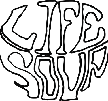
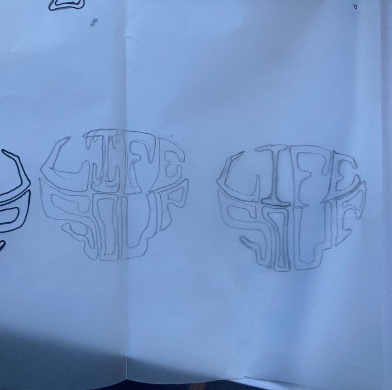
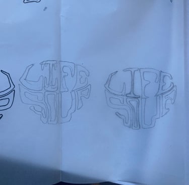
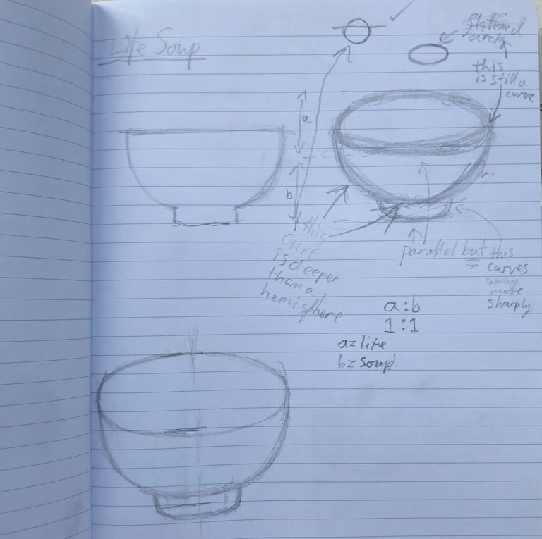
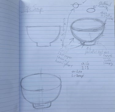
I started by sketching in my notebook, and I particularly liked the idea of incorporating the shape of a soup bowl. After some consideration, I wanted to present the words in the shape of a soup bowl, and I particularly liked the idea of "Life" being the contents and "Soup" being the container.
After a year of working under the alias "Protista", I decided that I wasn't really happy with it. As a name it had the dual problem of looking generic on a lineup poster, but also appearing ambiguous and confusing to pronounce.
After some heavy brainstorming, I decided to settle on a name that I'd considered for a while: Life Soup. This seemed to be a much better name as it was unique, easy-to-pronounce, and catchy. It also held a double meaning for me: firstly it juxtaposed a big, wide and deep concept (Life) with the everyday and the simple (Soup), which felt pretty real to me. Secondly I'm a bit of a nerd and "life soup" alludes to a theory of the origins of life, which suggests that we evolved from chemical reactions in a primordial soup, billions of years ago.
Re-brand
Life Soup
Sketches
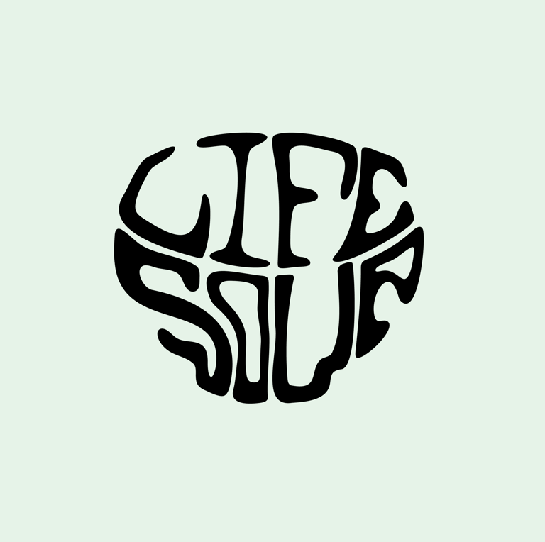
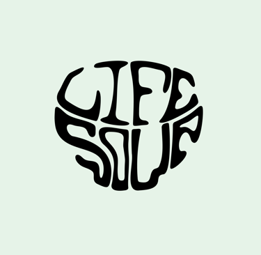
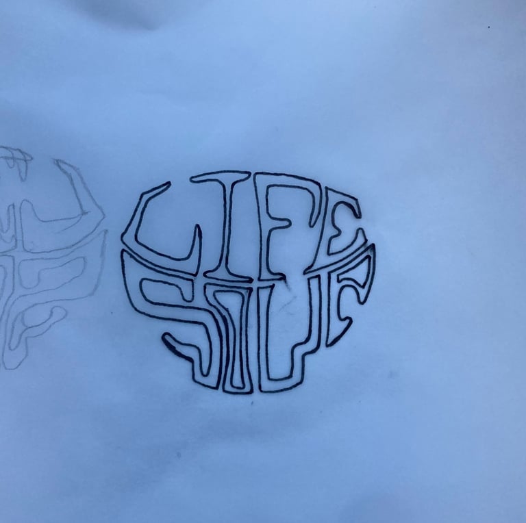
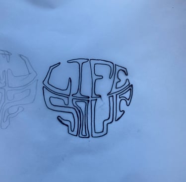
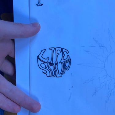
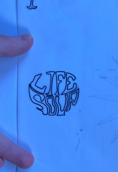
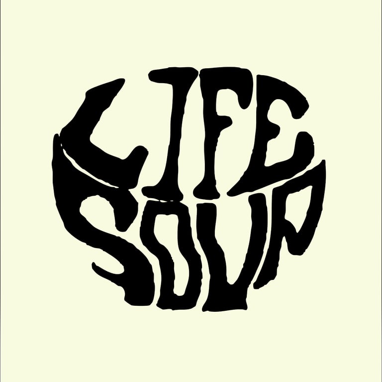
I re-sketched the design, within a faint soup bowl outline, before tracing it in pen on tracing paper, which I then scanned in and vectorised in illustrator. I experimented with a white logo and black outline, before settling on a solid logo on a pastel yellow background.
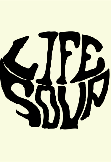
First draft