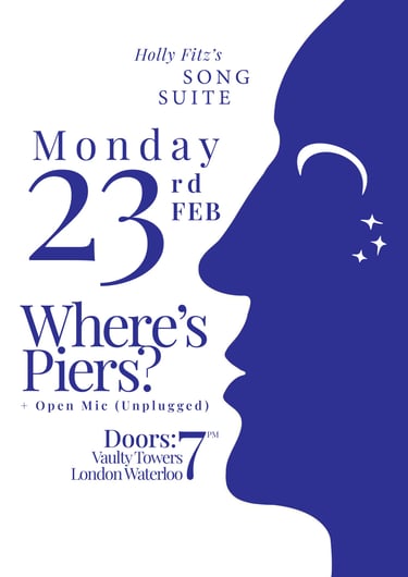
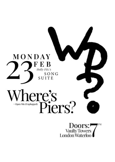
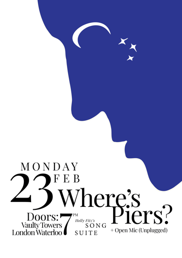
23 Feb Gig Poster
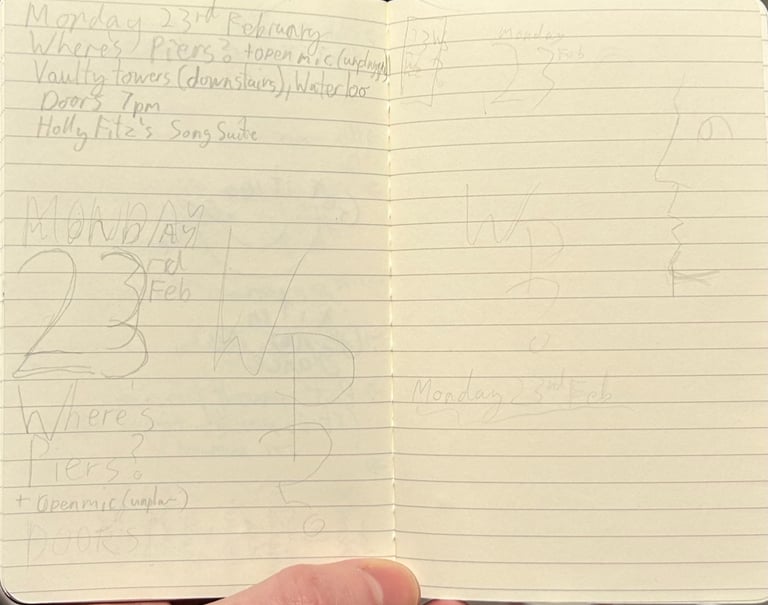
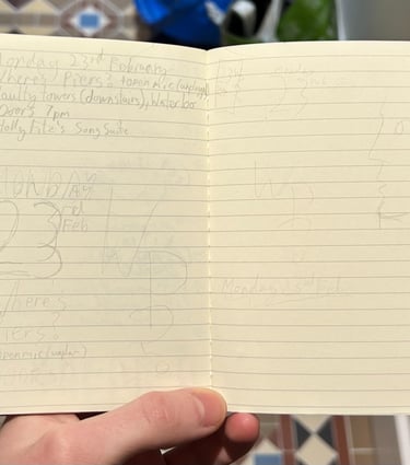
I began by writing out the necessary information for the poster, in order of importance.
I then sketched out rough ideas for how this information could communicated clearly, as well as thoughts for a graphic element to capture the eye and hint at what the emotional experience of the music would be like.
I had two main ideas that stood out.
Notebook/Sketches
One was based around capturing the ideas of night-time, reflecting on the self and being transported elsewhere through imagination.
Two designs
The other was based around secretive symbolism, monogram designs and the mystery of hieroglyphic and script writing.
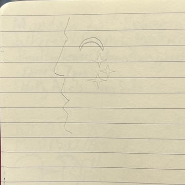
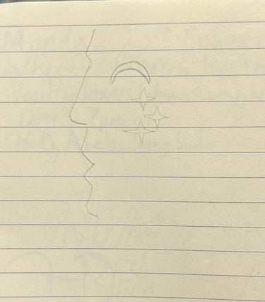
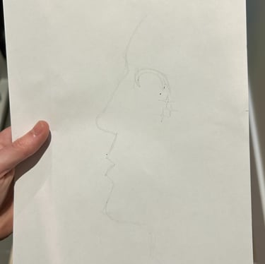
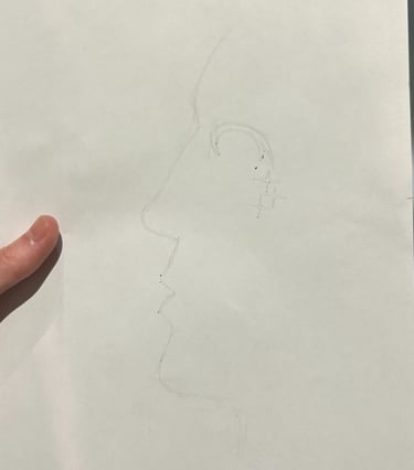
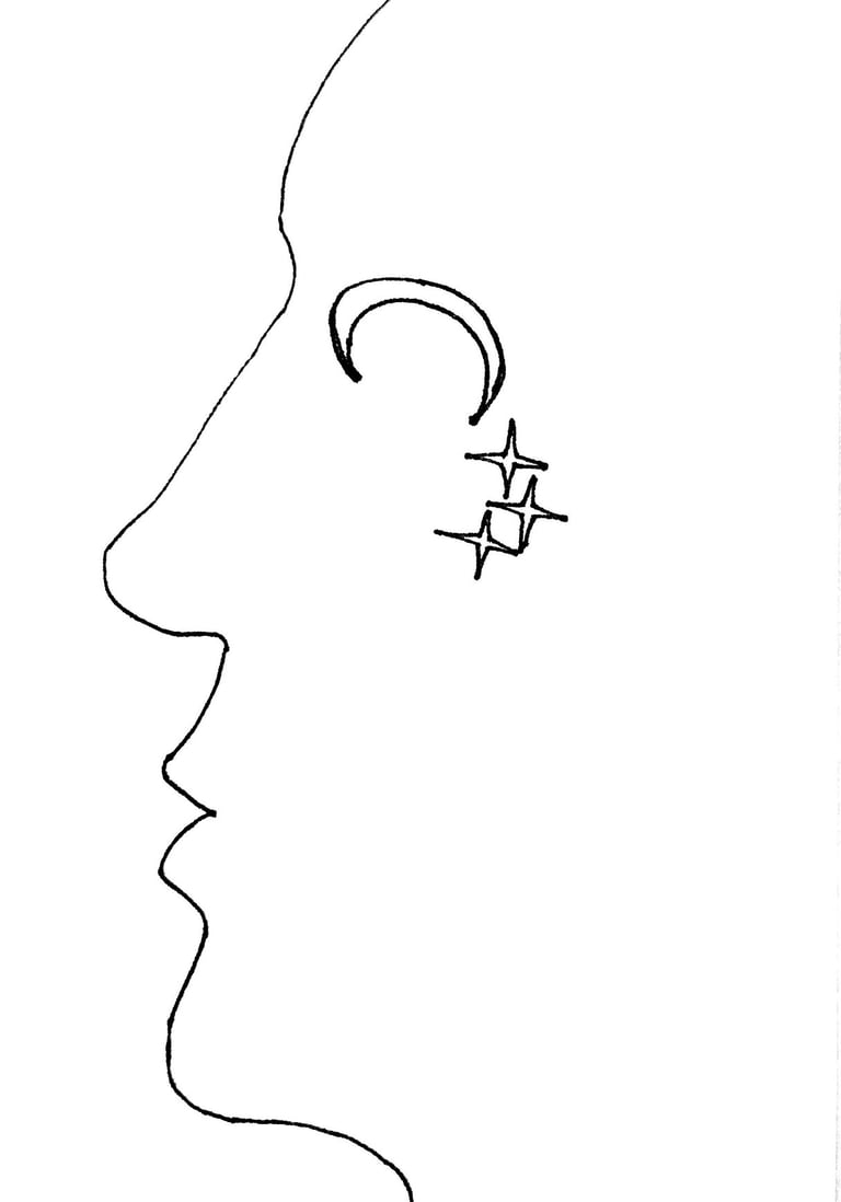
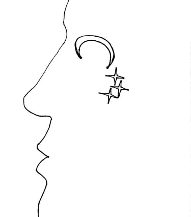
I sketched the design in pencil overleaf, to work it through. I drew it in neat pencil, then traced it in pen before scanning it in to be used in illustrator.
The Face/Hills at Night
I wanted to transport the viewer to a dream of distant hills at night, and simultaneously evoke the comfort of a human face. I wanted to bring up ideas of reflectiveness and also what dreaming feels like. I placed the stars around the moon like teardrops falling, or also the sparkle that sometimes emanates from people's eyes.


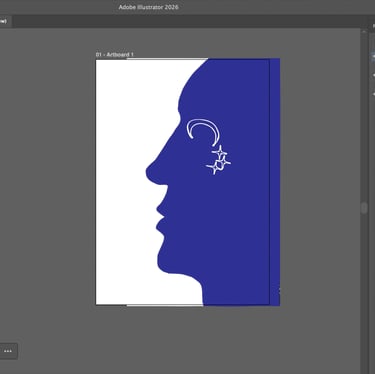
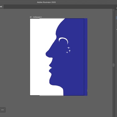
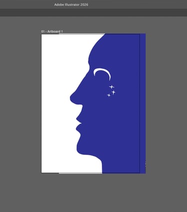
I wanted a very restricted colour palette for three reasons: visual clarity (inspired by the rule of tincture in heraldry), ease of printing and flexibility, and also a less-is-more overall approach.
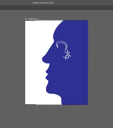
I wanted to try out how it looked with a black outline/white fill, a white outline/no fill and a solid white fill (which I chose).
Colour
Different versions
I imported the graphic into InDesign first, then assembled all the pieces of information following the rough idea from my notebook.
I wanted to go with a serif font for a number of reasons including elegance and also a desire to get away from the omnipresent Helvetica that we see everywhere. I chose Playfair Display which is based on 18th century display fonts, and felt like clear and elegant choice.
Design
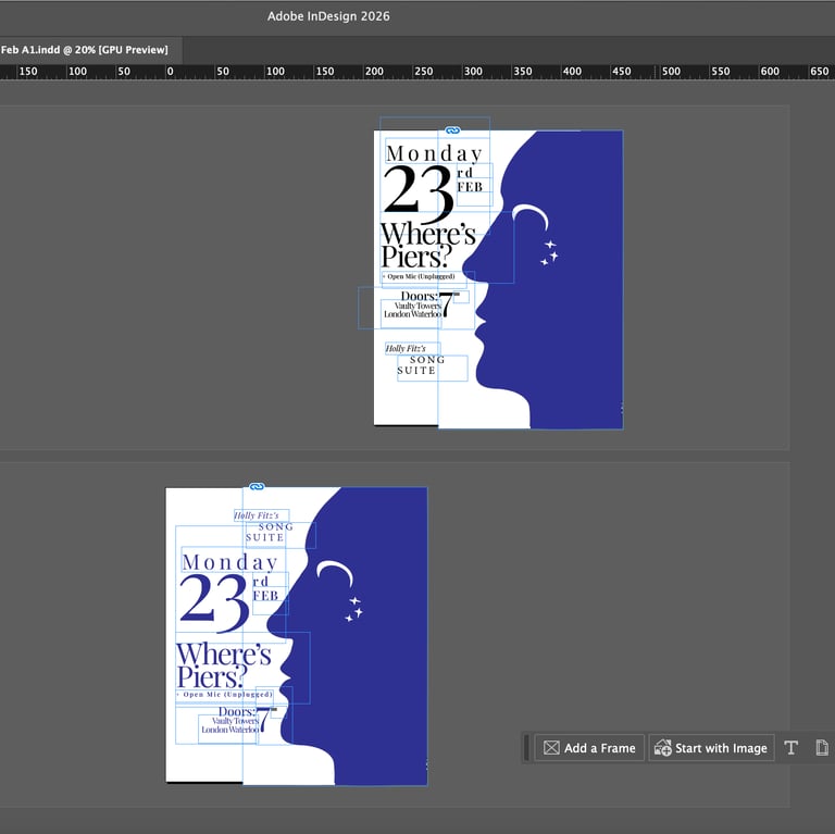
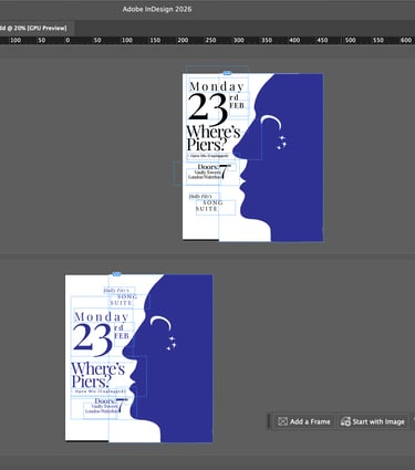
Then having established a starting point, I made a new page, grouped the pieces into their parts and copied them over to play around with the layout.
When I was done, I printed it out to come back to the following day.
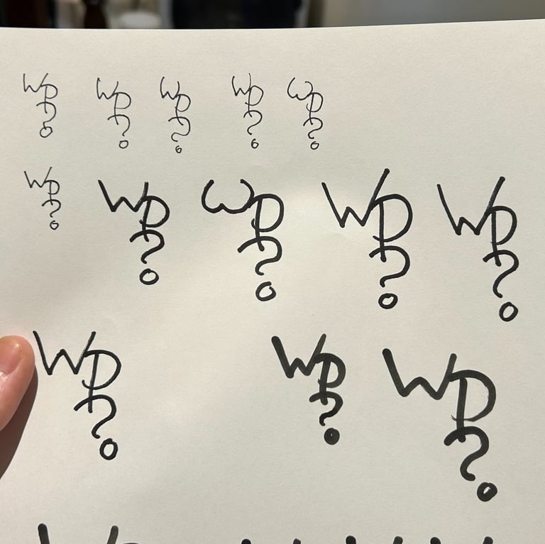
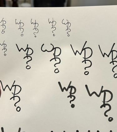
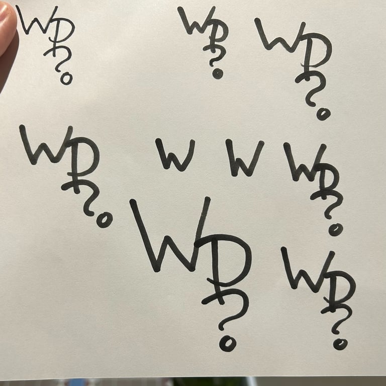
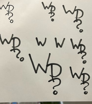
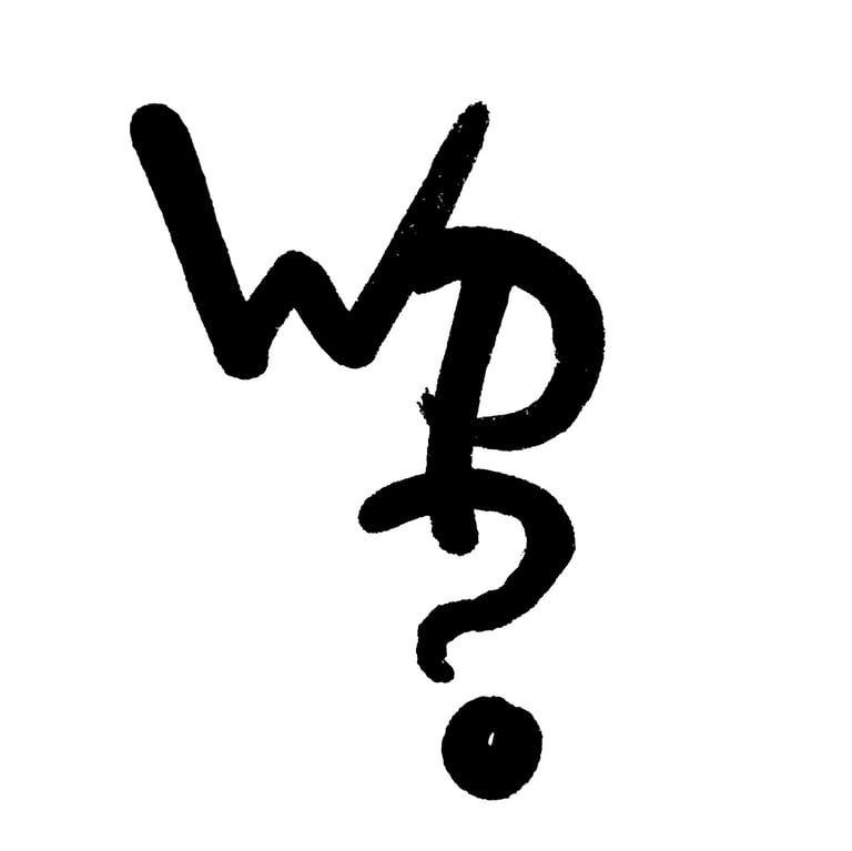
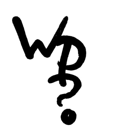
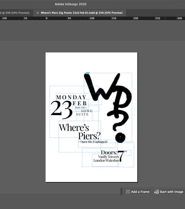
This monogram design is a device that I came up with when I first started this project. The intention was to create a symbol that could easily be drawn by anyone, and I was inspired by the band logos that I used to doodle in my exercise books at school. For this usage, I wanted to depict it in a way that was reminiscent of the brushstrokes of caligraphic scripts, particularly ancient Chinese scripts. I did a page of variations with a few different marker pens, and then chose the closest one to my intention. I then image-traced it in Illustrator.
Monogram
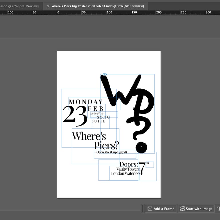
I imported the vector into InDesign, and then copied over some of the groups from the other poster version. I kept broadly the same typography as I was happy with the way it looked, but I rearranged the layout to echo the form of the monogram graphic. For me, a big inspiration for the layout of this poster variant was the Swiss School Style, particularly a 1956 poster by Emil Ruder for a Japanese calligraphy exhibition and a 1959 poster by Armin Hofmann for a Max Gubler exhibition.
Poster design
I ran my designs by my brother for an outside perspective over lunch, and I figured out that the face/night graphic had more intrigue than the monogram. However, I also figured out there were issues with the layout that meant that the information wasn't quite as clear as it could be.
I sat back down after lunch and re-ordered the text to find new ways to get it to fit together, letting go of some of my original ideas. Because the result ended up more horizontal, I decided to take inspiration from theatrical and travel posters (such as vintage ski posters) which often place the image at the top to draw in the eye.
Reaction
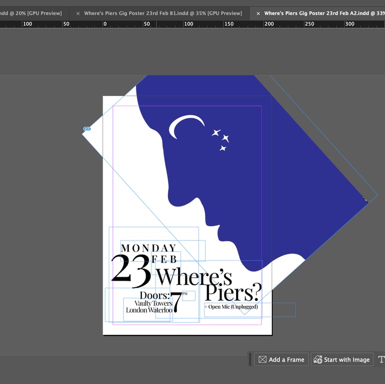
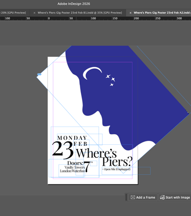
I also rotated and zoomed the graphic to make its dual image clearer and also to make the face interact with the text. I also found this new composition more pleasing, as by losing some aspects of the design to the crop, it changed the focus ultimately adding to the experience.
I laid out the three versions on the table, and decided that the final one (right) was the strongest implementation of my intention, so I decided to go forward with this one and get it printed.
Final image
