Les Fruits de Mer
Beginnings
I was partially inspired in this by the work of Paweł Kuczyński and Banksy, which I wanted to combine with the form of collage. The other central aspect of this work was the type design side, in which my main inspiration was Herb Lubalin.
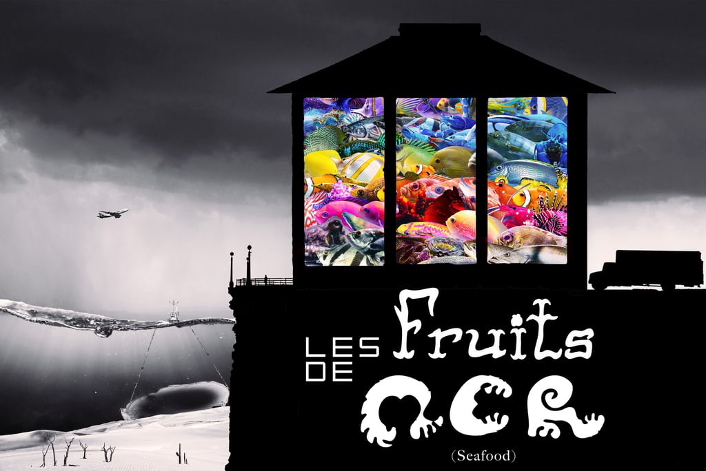
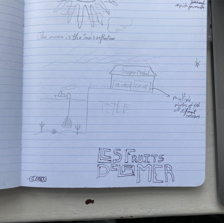
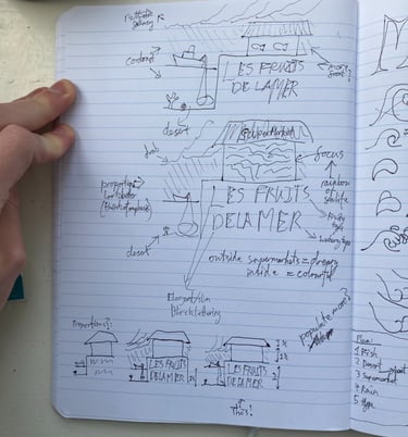
I first sketched this idea in a sketching session that I did in my notebook, after trying to visualise a way that I could communicate the problem of overfishing in an emotionally impactful way. The core idea was to contrast the beautiful diversity of fish, with the barren state that we are leaving our oceans in. I really wanted to use bold symbols and visual metaphors to show what I meant.
Inspiration
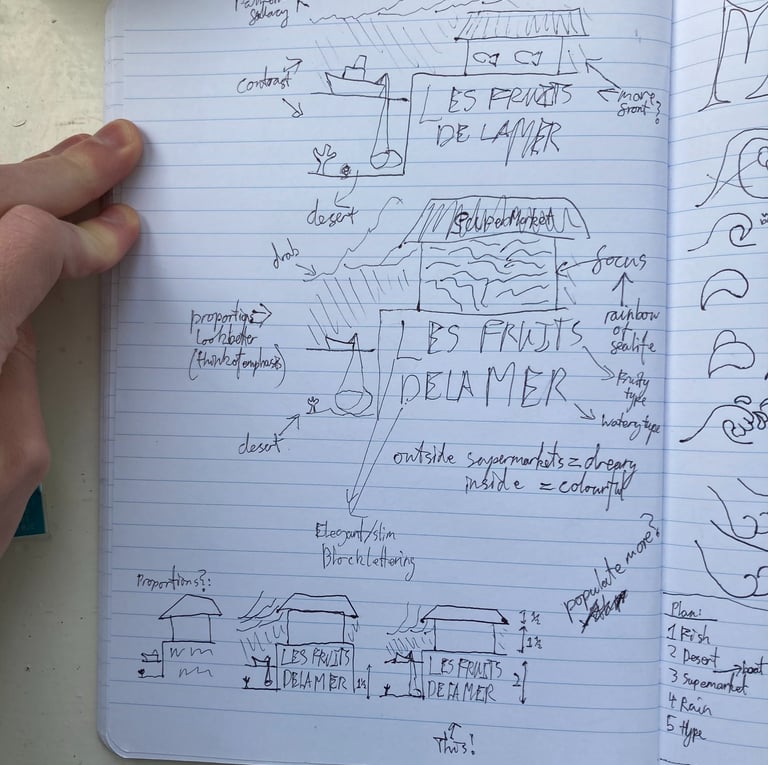
This work was intended to be reproduceable as a large poster as well as an online piece of digital art, which lead to design decisions being made for close up details as well as the big picture. For this reason its dimensions are 12000 × 8000px.
Considerations
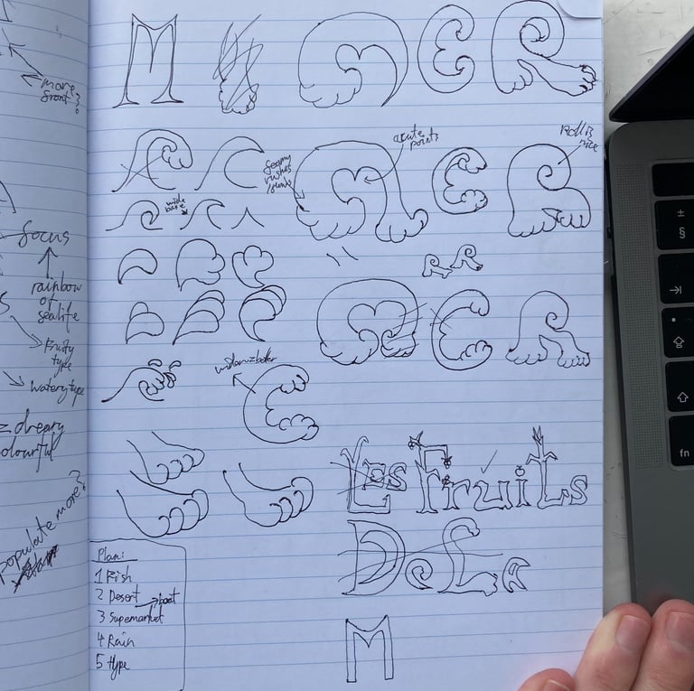
Given the importance of this work's composition, I then did a number of sketches working out the details of its proportions and the main rules for executing the vision successfully. I also spent a page working out the main ideas of the type design and I made a plan for the stages in which I would bring this work together.
Details

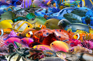
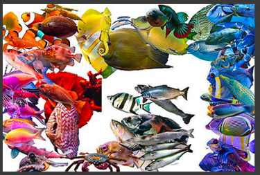
As the 'rainbow of fish' would be the central focus of this piece, this was the section that I made first.
I went through several copyright-free image sites to find as many colourful and clear images of fish as possible, then in a separate photoshop project, manually sorted them by colour so that I could then arrange my rainbow. This collage part was a bit like a jigsaw puzzle, fitting the different fish together by shape and size while also maintaining colour order and a sense of the whole structure.
Rainbow
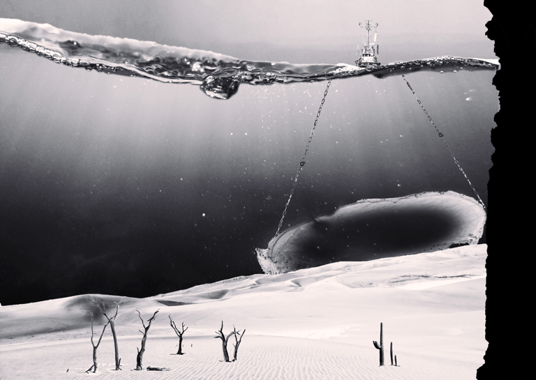

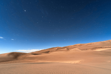
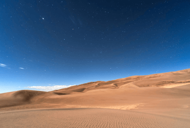
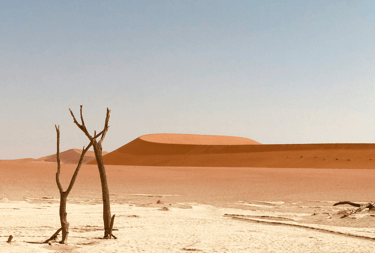
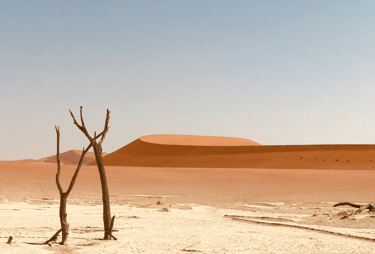

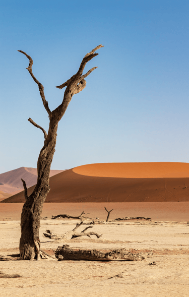

The next section of the artwork to work on was the "barren" ocean. The central way in which I showed this was by representing the ocean floor as a lifeless desert. I chose not to show any life swimming around and actually constructed it out of copyright-free images of desert environments.
Barren
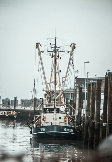
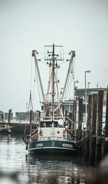
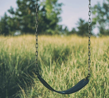
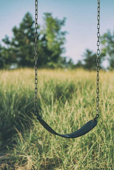
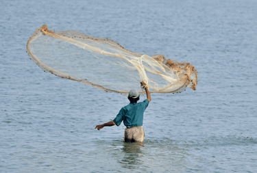
In the background, I wanted to show the threat of the open net of a trawler looming ominously for dramatic effect and also as narrative device to show how this happened. I couldn’t find any copyright-free images of trawlers fishing in the position and orientation that I imagined, or any trawler's nets from this particular angle either, so I combined the image of a docked trawler with a fisherman's throw-net, using a playground swing to make the chains. I believe that this is a more effective representation than you could physically photograph as it conveys clearly what's happening above and below the water from a perspective that would be impossible for a camera to capture.
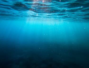
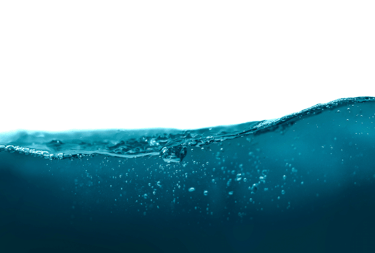
I lined the net up with the dunes to give the impression of a bulldozer and I made it cavernous and empty to give it the feeling of cosmic horror. I used two images for the sea itself, one to create a sense of depth with its rays and shadow, and the other to mark the horizon in a choppy disorienting way that also plays with scale to clearly mark the art as representational/symbolic.
Threat
Emptiness
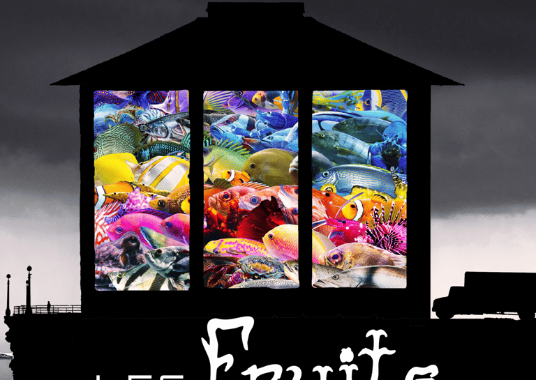
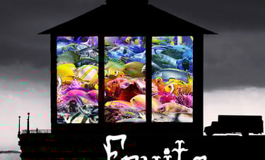


The following phase in this artwork was to represent the supermarket and land. This was done largely through silhouettes in order to remove any unnecessary information but also to heighten the symbolic aspects of this depiction.
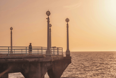
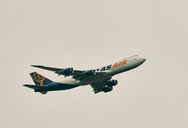
I wanted to convey themes of order, systems, illusory promise, and the sense of feeling caged. This was done by placing the fish behind the supermarket windows, which look simultaneously like prison bars or advertisements. The van and plane (below) also add to the sense of mass industry, logistical operations and globalism. I took the roof from a building in Bude, Cornwall as well as using images of a harbourside and pier to blend this section into its seaside surroundings.
Finally, I chose an image of a pier that had a person on it, looking into the distance, because as the only sign of life in the rest of the image, I wanted this figure to be a stand-in for the viewer; like this figure we are also looking out into this world, and I wanted to raise the question of our own reactions, as active participants in this piece. We, the viewer, are to our world/real life what this image of a viewer is to the world in the art.
Land
Themes
The Viewer

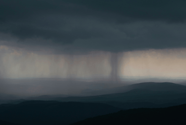
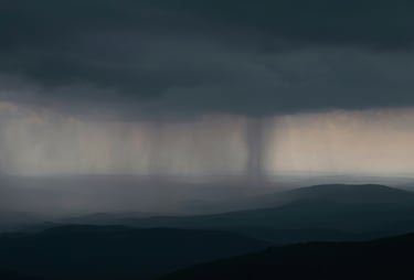
For the sky I used a simple case of pathetic fallacy, by finding an image of grey, indistinct rainy weather which also had the practical benefit of contrasting nicely with the colour of the fish.
Sky

Finally I worked out "les", making it in a square, symmetrical, sans-serif style to keep it clear and simple.
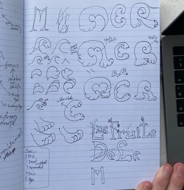
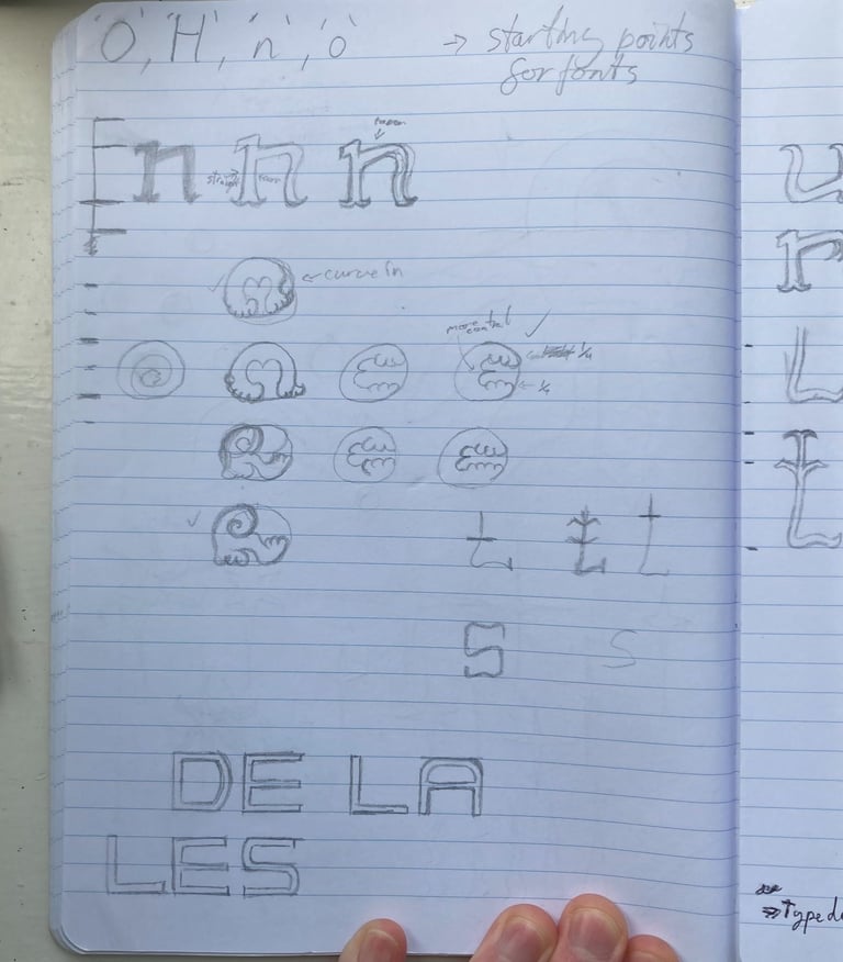
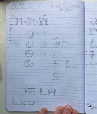
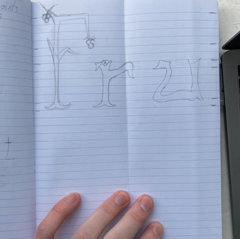
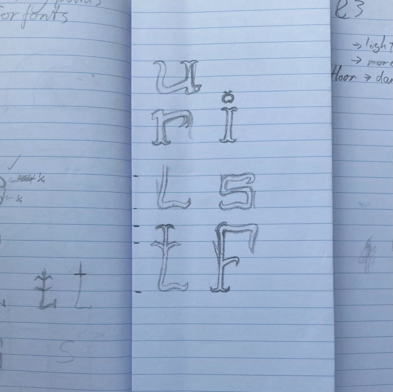
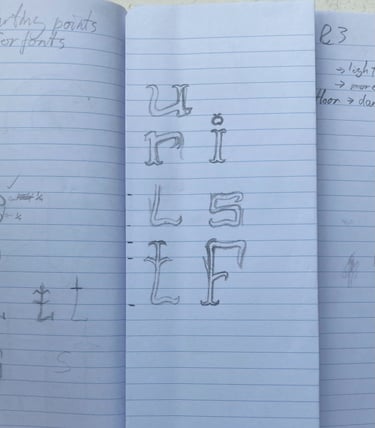
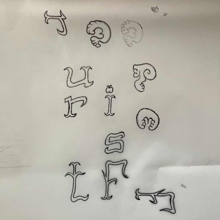
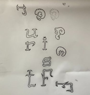
For the next phase, I had to work out some consistent designs for the type, based on the ideas that I'd previously sketched.
I started with "fruits" and picked the letter 'n' as my starting point (despite it not appearing) because the principles of the form of the letter 'n' appear in most of the rest of the alphabet. I then used this to form the letters that I needed on the opposite page. In the meanwhile, I had also worked out some rough proportions and ideas on another page.
Next for "mer", I drew a number of rough circles, doing them by hand to keep them organic and not too mathematical.
Type
I then sketched out my ideas, working them through until the proportions were where I wanted them.
Fruits
Mer
Les
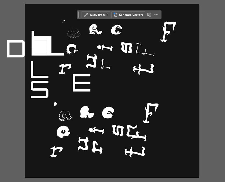
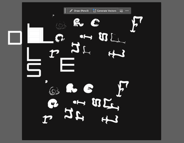
I traced the designs for "fruits" and "mer" onto tracing paper, going over them in pen. I then scanned them in and vectorised them in illustrator, before creating a template out of right angles and set distances to create my "les" font digitally. I then exported these and imported them into the main photoshop project.
Tracing