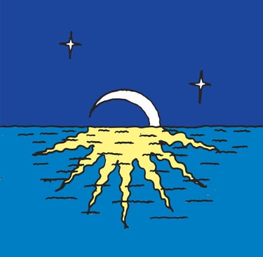
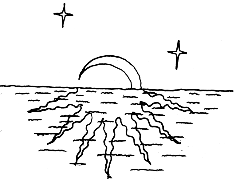
I then scanned it in, vectorised it in illustrator and roughly coloured it. Finally I opened it in photoshop to do overall colour and brightness adjustments until the values worked together.
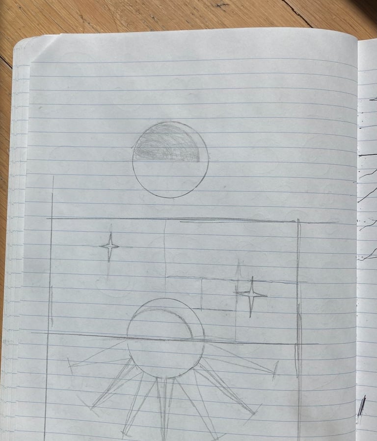
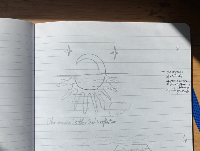
I first sketched this idea during a doodling session. I quite liked the way this idea played with concepts visually, showing a double meaning in a literal way (like a visual wordplay). I then did some more sketching to work out how I wanted to depict this idea.
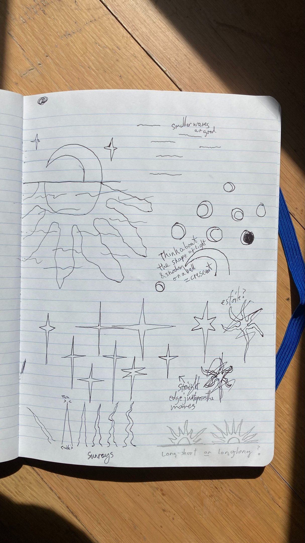
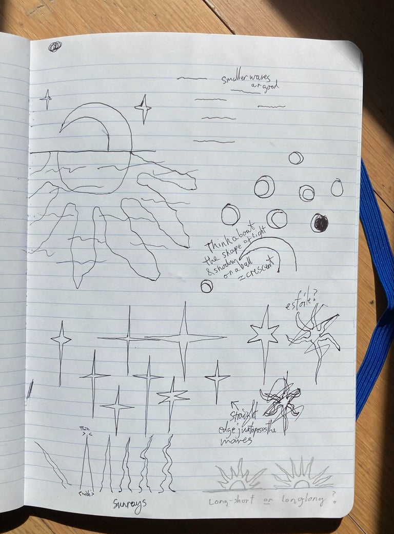
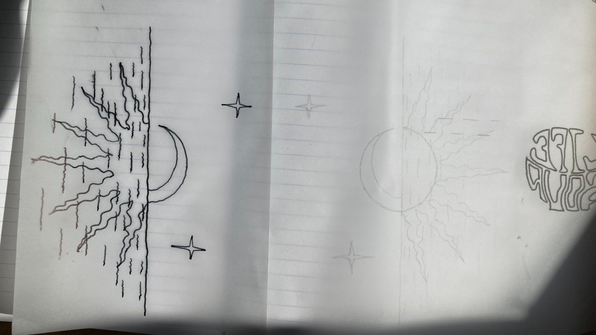
In particular, I worked on the orientation of the crescent moon, which meant understanding it as the shape of shadow on a sphere, and working out which angle the light was coming from. I also worked on the style of the waves, the shape of the stars and the waviness of the sun's rays, and their overall pattern.
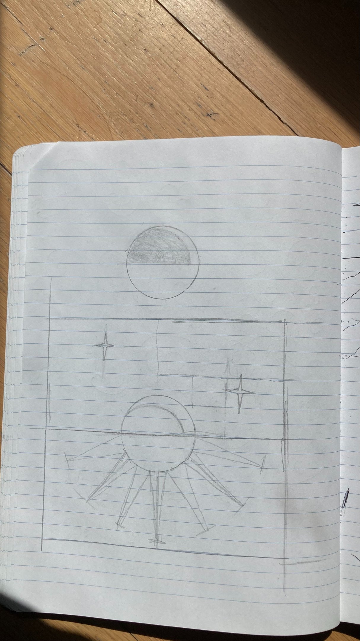
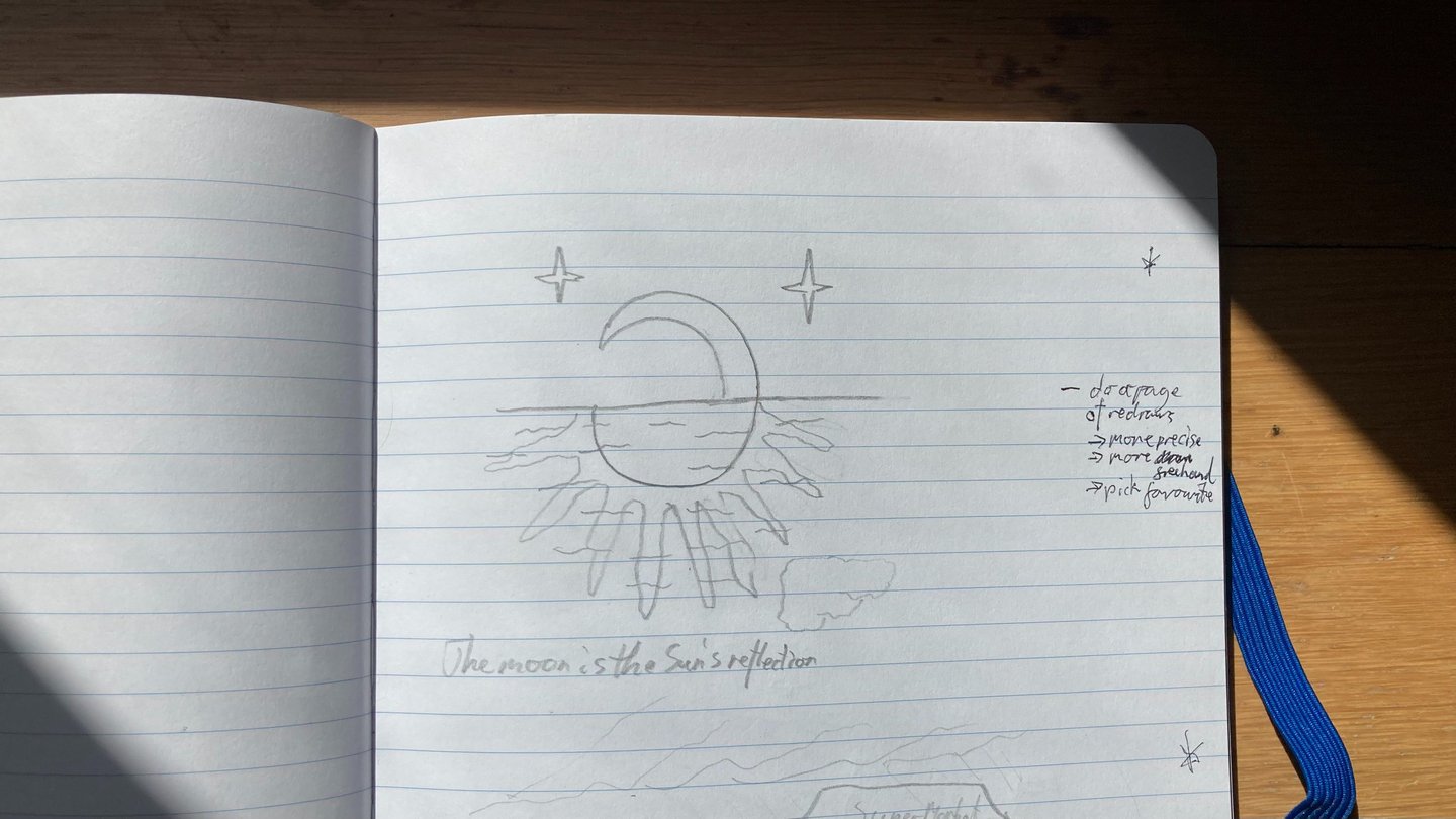
When I was happy with the component parts, I drew a symmetric template for the overall composition and decided the placement of the stars based on a very loose golden ratio. I decided the crescent looked best if it was at more of an angle, so that it would complete the circle more (once halved).
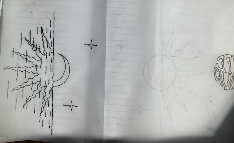
I then used tracing paper to sketch my design over this template in pencil, then folded it and traced that in pen.